SFO airport by BART? Watch your wallet!
Posted on May 17, 2012

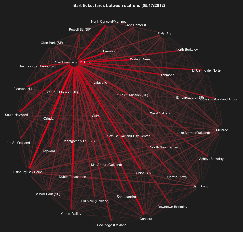
In one of my visualization projects, I felt curiosity to visualize the fares between BART stations. I was shocked by how much it costs to go to San Francisco airport by BART.
One possibility to have a visual representation is by using a graph network. In this case, the nodes of the graph represent the stations, while the fares are represented by the edges. The pricier a fare, the thicker and brighter its corresponding edge. As you can tell from the previous graph, the SFO Int’l Airport station has the thicker and reddish edges, meaning it is the most expensive one. Why is so fucking expensive to go to SFO airport by Bart?