Bart Ridership
Posted on May 25, 2012

Ever wonder how many people exit at BART stations on a typical weekday? You can check the numbers in the BART reports page where there are a lot of data files to play with.
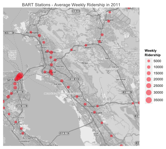
As part of the visualization of BART ridership, I created this graphic with the help of the R package ggmap and its useful functions to get maps from openstreetmap (and from other options like google maps). The average number of people exiting most BART stations on a typical weekday is around 5000. However, numbers rocket sky in the stations located on Market street (San Francisco): Embarcadero, Montgomery, and Powell. Just look at the big red circles on the map; that’s where riders concentrate.