Gauge Chart in R
Posted on January 10, 2013
How to replicate a google gauge chart in R?
Google charts has several options to produce nice graphics. Most of them have their equivalent function in R and can be quickly replicated, but some of them require a bit of programming.
For instance, take the google gauge charts which I really like:
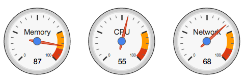
A gauge is a very common chart used in information dashboards; you can use a gauge when you want to show a single value within a given scale. These charts typically show a key indicator within a range of values, employing a semaphoric color code (eg green, yellow, red). Although some people say gauges provide very little information for the amount of space they consume, we’re not going to discuss whether gauges are good or bad, or what type of colors we should use. We’re just going to see how we can create gauges in R.
Preliminaries
Look at the following gauge from google charts:
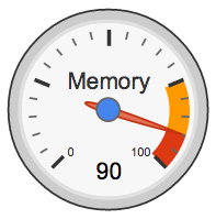
We can distinguish the following elements:
- circles (black and grey circles in the circumference)
- bands (yellow and red stripes)
- major ticks
- minor ticks
- minimum and maximum values (0, 100)
- value (eg 90)
- label (Memory)
- blue point in the middle
- needle
The idea is to break down the chart into its different components so we can have a better idea of how to create a gauge chart in R.
Handy Functions
We will need three auxiliary functions to produce the circles, the stripe-bands, and the tick marks around the gauge. Keep in mind that we will be working going back and forth between radians and degrees to get the x-y coordinates of the elements we’re going to plot.
# function to create a circle
circle <- function(center=c(0,0), radius=1, npoints=100)
{
  r = radius
  tt = seq(0, 2*pi, length=npoints)
  xx = center[1] + r * cos(tt)
  yy = center[1] + r * sin(tt)
  return(data.frame(x = xx, y = yy))
}

# function to get slices
slice2xy <- function(t, rad)
{
  t2p = -1 * t * pi + 10*pi/8
  list(x = rad * cos(t2p), y = rad * sin(t2p))
}

# function to get major and minor tick marks
ticks <- function(center = c(0, 0), from = 0, to = 2*pi,
                  radius = 0.9, npoints = 5)
{
  r = radius
  tt = seq(from, to, length = npoints)
  xx = center[1] + r * cos(tt)
  yy = center[1] + r * sin(tt)
  return(data.frame(x = xx, y = yy))
}
Preparing elements
After defining the handy functions, we need to create the components that will be plotted: the black border, the gray circles, the yellow stripe, the red stripe, the major tick marks, the minor tick marks, the coordinates of the minimum and maximum values, the value indicator, the needle, and the label. Here’s how we can define all these elements:
# external circle (this will be used for the black border)
border_cir = circle(c(0, 0), radius = 1, npoints = 100)

# gray border circle
external_cir = circle(c(0,0), radius = 0.97, npoints = 100)

# yellow slice (this will be used for the yellow band)
yellowFrom = 75
yellowTo = 90
yel_ini = (yellowFrom / 100) * (12/8)
yel_fin = (yellowTo / 100) * (12/8)
Syel = slice2xy(seq.int(yel_ini, yel_fin, length.out = 30), rad = 0.9)

# red slice (this will be used for the red band)
redFrom = 90
redTo = 100
red_ini = (redFrom / 100) * (12/8)
red_fin = (redTo / 100) * (12/8)
Sred = slice2xy(seq.int(red_ini, red_fin, length.out = 30), rad = 0.9)

# white slice (this will be used to get the yellow and red bands)
whiteFrom = 74
whiteTo = 101
white_ini = (whiteFrom/100) * (12/8)
white_fin = (whiteTo/100) * (12/8)
Swhi = slice2xy(seq.int(white_ini, white_fin, length.out = 30), rad = 0.8)

# coordinates of major ticks (will be plotted as arrows)
major_ticks_out = ticks(c(0,0), from = 5*pi/4, to = -pi/4, radius = 0.9, 5)
major_ticks_in = ticks(c(0,0), from = 5*pi/4, to = -pi/4, radius = 0.75, 5)

# coordinates of minor ticks (will be plotted as arrows)
tix1_out = ticks(c(0, 0), from = 5*pi/4, to = 5*pi/4-3*pi/8, radius = 0.9, 6)
tix2_out = ticks(c(0, 0), from = 7*pi/8, to = 7*pi/8-3*pi/8, radius = 0.9, 6)
tix3_out = ticks(c(0, 0), from = 4*pi/8, to = 4*pi/8-3*pi/8, radius = 0.9, 6)
tix4_out = ticks(c(0, 0), from = pi/8, to = pi/8-3*pi/8, radius = 0.9, 6)
tix1_in = ticks(c(0, 0), from = 5*pi/4, to = 5*pi/4-3*pi/8, radius = 0.85, 6)
tix2_in = ticks(c(0, 0), from = 7*pi/8, to = 7*pi/8-3*pi/8, radius = 0.85, 6)
tix3_in = ticks(c(0, 0), from = 4*pi/8, to = 4*pi/8-3*pi/8, radius = 0.85, 6)
tix4_in = ticks(c(0, 0), from = pi/8, to = pi/8-3*pi/8, radius = 0.85, 6)

# coordinates of min and max values (0, 100)
v0 = -1 * 0 * pi + 10*pi/8
z0x = 0.65 * cos(v0)
z0y = 0.65 * sin(v0)
v100 = -1 * 12/8 * pi + 10*pi/8
z100x = 0.65 * cos(v100)
z100y = 0.65 * sin(v100)

# indicated value, say 80 (you can choose another number between 0-100)
value = 80

# angle of needle pointing to the specified value
val = (value/100) * (12/8)
v = -1 * val * pi + 10*pi/8
# x-y coordinates of needle
val_x = 0.7 * cos(v)
val_y = 0.7 * sin(v)

# label to be displayed
label = "UseR!"
Putting everything together
Once we have all the ingredients, the last step is to put them all together in a plot like so:
# open plot
plot(border_cir$x, border_cir$y, type="n", asp=1, axes=FALSE,
     xlim=c(-1.05,1.05), ylim=c(-1.05,1.05),
     xlab="", ylab="")
# yellow slice
polygon(c(Syel$x, 0), c(Syel$y, 0),
        border = "#FF9900", col = "#FF9900", lty = NULL)
# red slice
polygon(c(Sred$x, 0), c(Sred$y, 0),
        border = "#DC3912", col = "#DC3912", lty = NULL)
# white slice
polygon(c(Swhi$x, 0), c(Swhi$y, 0),
        border = "white", col = "white", lty = NULL)
# add gray border
lines(external_cir$x, external_cir$y, col = "gray85", lwd = 20)
# add external border
lines(border_cir$x, border_cir$y, col = "gray20", lwd = 2)
# add minor ticks
arrows(x0 = tix1_out$x, y0 = tix1_out$y, x1 = tix1_in$x, y1 = tix1_in$y,
       length = 0, lwd = 2.5, col = "gray55")
arrows(x0 = tix2_out$x, y0 = tix2_out$y, x1 = tix2_in$x, y1 = tix2_in$y,
        length = 0, lwd = 2.5, col = "gray55")
arrows(x0 = tix3_out$x, y0 = tix3_out$y, x1 = tix3_in$x, y1 = tix3_in$y,
       length = 0, lwd = 2.5, col = "gray55")
arrows(x0 = tix4_out$x, y0 = tix4_out$y, x1 = tix4_in$x, y1 = tix4_in$y,
       length = 0, lwd = 2.5, col = "gray55")
# add major ticks
arrows(x0 = major_ticks_out$x, y0 = major_ticks_out$y,
       x1 = major_ticks_in$x, y1 = major_ticks_in$y, length = 0, lwd = 4)
# add value
text(0, -0.65, value, cex = 4)
# add label of variable
text(0, 0.43, label, cex = 3.8)
# add needle
arrows(0, 0, val_x, val_y, col = "#f38171", lwd = 7)
# add central blue point
points(0, 0, col = "#2e9ef3", pch = 19, cex = 5)
# add values 0 and 100
text(z0x, z0y, labels = "0", col = "gray50")
text(z100x, z100y, labels = "100", col = "gray50")