Visualizing Correlations with Corrgrams
Posted on June 01, 2013
In this post we’ll talk about corrgrams: a graphical tool for visualizing a matrix of correlations.
Corrgrams
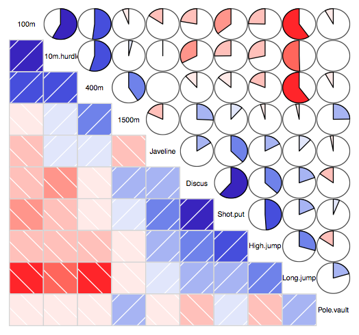
One of the very basic tasks when analyzing some dataset is to examine the correlations of the available variables. Assuming that the data is in matrix format (observations in rows, variables in columns), the typical approach to get the correlations is by calculating the matrix of correlations.
Among the different plotting options that we can use to visualize such correlations, we have the so-called corrgrams. A corrgram is just a graphical representation of the cells of a matrix of correlations. The idea is to display the pattern of correlations in terms of their signs and magnitudes using visual thinning and correlation-based variable ordering. Moreover, the cells of the matrix can be shaded or colored to show the correlation value.
In R, we have two useful packages that provide functions to plot corrgrams:
"corrgram" (by Kevin Wright) and "ellipse" (by Duncan Murdoch and E. D. Chow).
Toy example
Here’s a very basic example using corrgram()
# load packages
library(corrgram)
# create correlation matrix
set.seed(707)
R = cor(matrix(rnorm(70), 10, 7))
# vector of colors (purple to orange)
purple_orange = c("#8073AC","#B2ABD2","white","#E08214","#FDB863")
# create correlation matrix
corrgram(R, order=TRUE, lower.panel = panel.shade, upper.panel = panel.pie,
text.panel = panel.txt, main = "Example",
col.regions = colorRampPalette(purple_orange))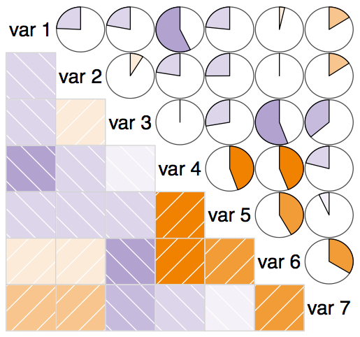 </a>
</a>
Here’s the link to the Rpub with the complete code in R.