Replicating google line chart in R
Posted on May 30, 2012
R is great for graphics although sometimes it can be really tricky to replicate other software charts. Take for example some of the graphics displayed with google charts such as the line chart displayed below.
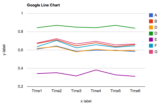
This google chart took me a dozen of clicks and a couple of minutes to create it. Honestly, it’s not that bad at all. I bet we could also create something similar in excel. However, if we want to produce the same graphic in R we’re going to need a good amount of patience and some guide to get the right color palette (I used the following website to get some colors color hex. So, let me show you how to mimic the google line chart with R. I guarantee you it is possible.
Code in R
# here's the data
numbers = c(
  0.61, 0.644, 0.586, 0.598, 0.596, 0.584,
  0.67, 0.712, 0.646, 0.68, 0.638, 0.66,
  0.618, 0.638, 0.58, 0.608, 0.592, 0.596,
  0.844, 0.87, 0.85, 0.844, 0.87, 0.838,
  0.342, 0.352, 0.316, 0.382, 0.328, 0.312,
  0.636, 0.704, 0.624, 0.658, 0.63, 0.646,
  0.676, 0.724, 0.666, 0.696, 0.656, 0.666)

# put the data in a matrix
some_data = matrix(numbers, nrow = 7, ncol = 6, byrow = TRUE)

# add row and column names
rownames(some_data) = c("A", "B", "C", "D", "E", "F", "G")
colnames(some_data) = paste("Time", 1:6)

# define color palette
cols = c("#1664d9", "red", "orange", "green4", "purple2", "#1f9eb3", "#d93572")
Once we’ve defined the toy data, we just need to specify a layout and then the plot:
# choose a graphic layout
layout(rbind(c(1, 2), c(1, 2)),
       height = c(lcm(11), 1),
       width = c(lcm(18), 1))

# set plot window for lines
op = par(mar = c(5, 5, 4, 1))
plot(1:6, some_data[1,], type = "n", xaxt = "n", yaxt = "n",
     xlab = "x label", ylab = "y label", bty = "n", ylim = c(0.2, 1))
# add major grid lines
abline(h = seq(0.2, 1, 0.2), col = c("black", rep("gray80", 4)))
# add title
mtext(side = 3, "Google Line Chart in R", at = 1.5, line = 0.5, font = 2)
# add x-axis tick labels
mtext(side = 1, colnames(some_data), at = 1:6)
# add y-axis tick labels
mtext(side = 2, seq(0.2, 1, 0.2), line = 1, at = seq(0.2, 1, 0.2), las = 2)
# plot lines
for (i in 1:nrow(some_data))
{
    lines(1:6, some_data[i,], col = cols[i], lwd = 3)
}
# plot legend
par(mar = c(5, 0.1, 4, 2))
plot(rep(0.5,7), seq(0, 1, length = 7), type = "n", xlab = "", ylab = "",
     bty = "n", xaxt = "n", yaxt = "n", xlim = c(0.4, 0.7), ylim = c(0.2, 1))
points(rep(0.5, 7), seq(0.98, 0.6, length = 7), pch = 15,
       col = cols, cex = 2.5)
text(rep(0.6, 7), seq(0.98, 0.6, length = 7), rownames(some_data), cex = 1.2)
# reset parameters
par(op)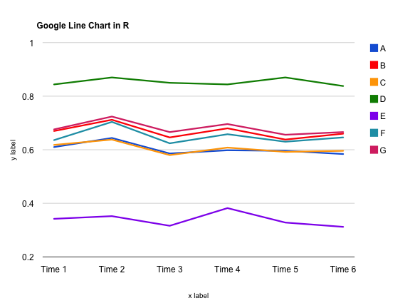
That’s it!