Pretty Tree Graph
Posted on July 05, 2014
In this post I’m sharing the code snippet in R I used to get a pretty graph to visualize dendrograms and clusters in an alternative way.
Recipe
The general recipe consists of the following steps:
- Obtain a distance matrix from your data set with
dist() - Perform a hierarchical clustering analysis with
hclust() - Examine the dendrogram to determine the number of clusters
- Cut the dendrogram to obtain clusters with
cutree() - Convert cluster structure into a
"phylo"object withas.phylo() - Use the tree nodes from the
"phylo"object to obtain a graph withgraph.edgelist() - Obtain a graph layout, in this case with
layout.auto() - Plot the data with the x-y coordinates from the graph layout!
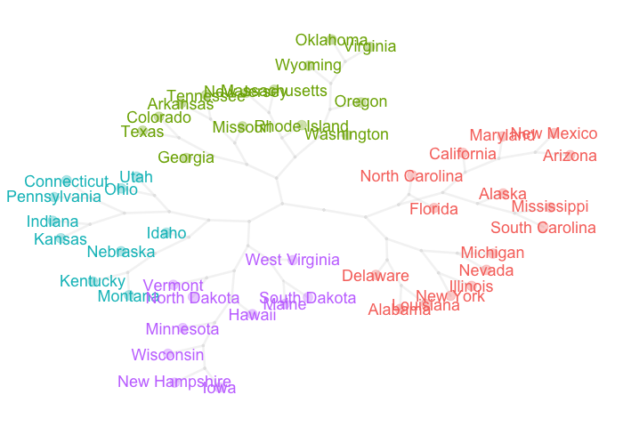
Example with data “USArrests”
For this example I’m going to use the data set USArrests that comes with R.
The idea is to get a dendrogram from a hierarchical clustering analysis. For
illustration purposes I’m going to cut the dendrogram in 4 clusters.
# distance matrix
dist_usarrests = dist(USArrests)

# hierarchical clustering analysis
clus_usarrests = hclust(dist_usarrests, method = "ward.D")

# plot dendrogram
plot(clus_usarrests, hang = -1)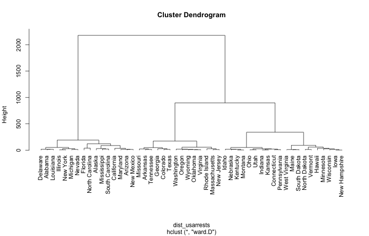
Code in R: Pretty Tree Graph
Once we have the “not very outstanding” dendrogram, we can do some data wrangling in order to obtain a better layout to display the obtained clusters in a very appealing visual way. Here’s the code snippet in R (feel free to adapt it for your own visualizations).
pretty_tree <- function(dataset, num_clusters = 2,
    dist_method = "euclidean", clus_method = "ward.D")
{
  # required packages
  require(ape)     # for phylo trees
  require(igraph)  # for graphs

  # distance matrix
  dist_data = dist(dataset, method = dist_method)
  # hierarchical clustering
  hcluster = hclust(dist_data, method = clus_method)
  # cut dendrogram in given number of clusters
  clusters = cutree(tree = hcluster, k = num_clusters)

  # convert to phylo object
  phylo_tree = as.phylo(hcluster)
  # get edges
  graph_edges = phylo_tree$edge
  # convert to graph
  graph_net = graph.edgelist(graph_edges)
  # extract layout (x-y coords)
  graph_layout = layout.auto(graph_net)

  # colors like default ggplot2
  ggcolors <- function(n, alfa) {
    hues = seq(15, 375, length = n + 1)
    hcl(h = hues, l = 65, c = 100, alpha = alfa)[1:n]
  }

  # colors of labels and points
  txt_pal = ggcolors(num_clusters)
  pch_pal = paste(txt_pal, "55", sep='')
  txt_col = txt_pal[clusters]
  pch_col = pch_pal[clusters]

  # additional params
  nobs = length(clusters)
  nedges = nrow(graph_edges)

  # start plot
  plot(graph_layout[,1], graph_layout[,2], type = "n", axes = FALSE,
       xlab = "", ylab = "")
  # draw tree branches
  segments(
    x0 = graph_layout[graph_edges[,1],1],
    y0 = graph_layout[graph_edges[,1],2],
    x1 = graph_layout[graph_edges[,2],1],
    y1 = graph_layout[graph_edges[,2],2],
    col = "#dcdcdc55", lwd = 3.5
  )
  # add tree leafs
  points(graph_layout[1:nobs,1], graph_layout[1:nobs,2], col = pch_col,
         pch = 19, cex = 2)
  # add empty nodes
  points(graph_layout[(nobs+1):nedges,1], graph_layout[(nobs+1):nedges,2],
         col = "gray90", pch = 19, cex = 0.5)
  # add node labels
  text(graph_layout[1:nobs,1], graph_layout[1:nobs,2], col = txt_col,
       phylo_tree$tip.label, cex = 1.5, xpd = TRUE, font = 1)
}

# plot
pretty_tree(USArrests, num_clusters = 4)