5 functions to do Multiple Correspondence Analysis in R
Posted on October 13, 2012
Today is the turn to talk about five different options of doing Multiple Correspondence Analysis in R (don’t confuse it with Correspondence Analysis).
Put in very simple terms, Multiple Correspondence Analysis (MCA) is to qualitative data, as Principal Component Analysis (PCA) is to quantitative data. Well, maybe I’m oversimplifying a little bit because MCA has some special features that make it mathematically different from PCA, but they both share a lot of things in common from a data analysis standpoint.
As with PCA and Correspondence Analysis, MCA is just another tool in our kit of multivariate methods that allows us to analyze the systematic patterns of variations with categorical data. Keep in mind that MCA applies to tables in which the observations are described by a set of qualitative (i.e. categorical) variables. This means that in R you must have your table in the form of a data frame with factors (observations in the rows, qualitative variables in the columns).
MCA in R
In R, there are several functions from different packages that allow us to apply Multiple Correspondence Analysis. In this post I’ll show you 5 different ways to perform MCA using the following functions (with their corresponding packages in parentheses):
MCA()(FactoMineR)mca()(MASS)dudi.acm()(ade4)mjca()(ca)homals()(homals)
No matter what function you decide to use for MCA, the typical results should consist of a set of eigenvalues, a table with the row coordinates, and a table with the column coordinates.
Compared to the eigenvalues obtained from a PCA or a CA, the eigenvalues in a MCA can be much more smaller. This is important to know because if you just consider the eigenvalues, you might be tempted to conclude that MCA sucks. Which is absolutely false.
Personally, I think that the real meat and potatoes of MCA relies in its dimension reduction properties that let us visualize our data, among other things. Besides the eigenvalues, the row coordinates provide information about the structure of the rows in the analyzed table. In turn, the column coordinates provide information about the structure of the analyzed variables and their corresponding categories.
The Data
We’ll use the dataset tea that comes in the R package "FactoMineR" . It’s a data frame (of factors) containing the answers of a questionnaire on tea consumption for 300 individuals. Although the data contains 36 columns (i.e. variables), for demonstration purposes I will only consider the following columns:
- What kind of tea do you drink (black, green, flavored)
- How do you drink it (alone, w/milk, w/lemon, other)
- What kind of presentation do you buy (tea bags, loose tea, both)
- Do you add sugar (yes, no)
- Where do you buy it (supermarket, shops, both)
- Do you always drink tea (always, not always)
# load packages
require(FactoMineR)
require(ggplot2)

# load data tea
data(tea)

# select these columns
newtea = tea[, c("Tea", "How", "how", "sugar", "where", "always")]

# take a peek
head(newtea)
## Tea How how sugar where always
## 1 black alone tea bag sugar chain store Not.always
## 2 black milk tea bag No.sugar chain store Not.always
## 3 Earl Grey alone tea bag No.sugar chain store Not.always
## 4 Earl Grey alone tea bag sugar chain store Not.always
## 5 Earl Grey alone tea bag No.sugar chain store always
## 6 Earl Grey alone tea bag No.sugar chain store Not.always# number of categories per variable
cats = apply(newtea, 2, function(x) nlevels(as.factor(x)))
cats## Tea How how sugar where always
## 3 4 3 2 3 2Option 1: using MCA()
My preferred function to do multiple correspondence analysis is the MCA() function that comes in the fabulous package "FactoMineR" by Francois Husson, Julie Josse, Sebastien Le, and Jeremy Mazet. If you have seen my other posts you’ll know that this is one of favorite packages and I strongly recommend other users to seriously take a look at it. It provides the most complete list of results with different calculations for interpretation and diagnosis.
# apply MCA
mca1 = MCA(newtea, graph = FALSE)

# list of results
mca1
## **Results of the Multiple Correspondence Analysis (MCA)**
## The analysis was performed on 300 individuals, described by 6 variables
## *The results are available in the following objects:
##
## name description
## 1 "$eig" "eigenvalues"
## 2 "$var" "results for the variables"
## 3 "$var$coord" "coord. of the categories"
## 4 "$var$cos2" "cos2 for the categories"
## 5 "$var$contrib" "contributions of the categories"
## 6 "$var$v.test" "v-test for the categories"
## 7 "$ind" "results for the individuals"
## 8 "$ind$coord" "coord. for the individuals"
## 9 "$ind$cos2" "cos2 for the individuals"
## 10 "$ind$contrib" "contributions of the individuals"
## 11 "$call" "intermediate results"
## 12 "$call$marge.col" "weights of columns"
## 13 "$call$marge.li" "weights of rows"# table of eigenvalues
mca1$eig## eigenvalue percentage of variance cumulative percentage of variance
## dim 1 0.27976 15.260 15.26
## dim 2 0.25775 14.059 29.32
## dim 3 0.22014 12.008 41.33
## dim 4 0.18793 10.251 51.58
## dim 5 0.16876 9.205 60.78
## dim 6 0.16369 8.928 69.71
## dim 7 0.15289 8.339 78.05
## dim 8 0.13839 7.548 85.60
## dim 9 0.11569 6.310 91.91
## dim 10 0.08613 4.698 96.61
## dim 11 0.06221 3.393 100.00We can use the package "ggplot2()" to get a nice plot:
# data frame with variable coordinates
mca1_vars_df = data.frame(mca1$var$coord, Variable = rep(names(cats), cats))

# data frame with observation coordinates
mca1_obs_df = data.frame(mca1$ind$coord)

# plot of variable categories
ggplot(data=mca1_vars_df,
       aes(x = Dim.1, y = Dim.2, label = rownames(mca1_vars_df))) +
 geom_hline(yintercept = 0, colour = "gray70") +
 geom_vline(xintercept = 0, colour = "gray70") +
 geom_text(aes(colour=Variable)) +
 ggtitle("MCA plot of variables using R package FactoMineR")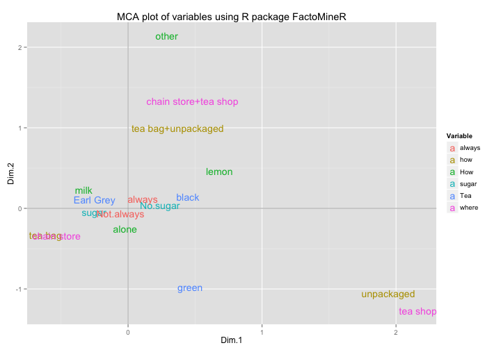
In order to have a more interesting representation, we could superimpose a graphic display of both the observations and the categories. Moreover, since some individuals will be overlapped, we can add some density curves with geom_density2d() to see those zones that are highly concentrated:
# MCA plot of observations and categories
ggplot(data = mca1_obs_df, aes(x = Dim.1, y = Dim.2)) +
  geom_hline(yintercept = 0, colour = "gray70") +
  geom_vline(xintercept = 0, colour = "gray70") +
  geom_point(colour = "gray50", alpha = 0.7) +
  geom_density2d(colour = "gray80") +
  geom_text(data = mca1_vars_df,
            aes(x = Dim.1, y = Dim.2,
                label = rownames(mca1_vars_df), colour = Variable)) +
  ggtitle("MCA plot of variables using R package FactoMineR") +
  scale_colour_discrete(name = "Variable")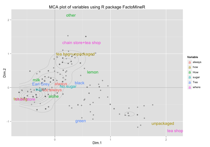
Option 2: using mca()
Another function for performing MCA is the mca() function that comes in the "MASS" package by Brian Ripley et al.
# load MASS
require(MASS)

# apply mca
mca2 = mca(newtea, nf = 5)

# eigenvalues
mca2$d^2
## [1] 0.2798 0.2577 0.2201 0.1879 0.1688# column coordinates
head(mca2$cs)## 1 2 3 4 5
## Tea.black -0.0081111 0.002719 -0.023118 0.01638 0.004040
## Tea.Earl Grey 0.0045538 0.002113 0.009848 -0.00155 -0.001838
## Tea.green -0.0084442 -0.018452 -0.005754 -0.02766 0.001690
## How.alone 0.0003982 -0.004760 -0.002118 -0.01015 -0.005462
## How.lemon -0.0124132 0.008793 0.025995 0.02224 -0.027419
## How.milk 0.0060215 0.004332 -0.001424 0.01422 0.031530# row coordiantes
head(mca2$rs)## 1 2 3 4 5
## 1 0.003145 -0.002793 -0.003668 0.0039064 -0.002256
## 2 0.002590 -0.001019 -0.007695 0.0053562 0.004107
## 3 0.003764 -0.002635 -0.002316 -0.0016939 -0.003038
## 4 0.005256 -0.002894 0.001827 0.0009183 -0.003235
## 5 0.003259 -0.002069 0.000312 -0.0036093 0.002301
## 6 0.003764 -0.002635 -0.002316 -0.0016939 -0.003038We can get an MCA plot of variables:
# data frame for ggplot
mca2_vars_df = data.frame(mca2$cs, Variable = rep(names(cats), cats))

# plot
ggplot(data = mca2_vars_df,
       aes(x = X1, y = X2, label = rownames(mca2_vars_df))) +
  geom_hline(yintercept = 0, colour = "gray70") +
  geom_vline(xintercept = 0, colour = "gray70") +
  geom_text(aes(colour = Variable)) +
  ggtitle("MCA plot of variables using R package MASS")
If you prefer not to use "ggplot2", you can stay with the default plots (not for me)
# default biplot in MASS (kind of ugly)
plot(mca2)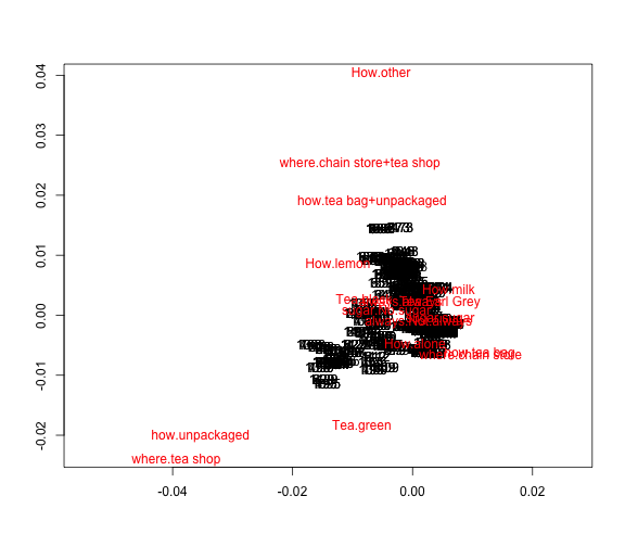
Option 3: using dudi.acm()
A third option to perform MCA is by using the function dudi.acm() that comes with the package "ade4" by Simon Penel et al (remember to install the package first).
# MCA with function dudi.acm
require(ade4)

# apply dudi.acm
mca3 = dudi.acm(newtea, scannf = FALSE, nf = 5)

# eigenvalues
mca3$eig
## [1] 0.27976 0.25775 0.22014 0.18793 0.16876 0.16369 0.15289 0.13839
## [9] 0.11569 0.08613 0.06221# column coordinates
head(mca3$co)## Comp1 Comp2 Comp3 Comp4 Comp5
## Tea.black -0.44585 0.1434 1.12722 -0.73788 0.17249
## Tea.Earl.Grey 0.25031 0.1115 -0.48017 0.06983 -0.07847
## Tea.green -0.46416 -0.9735 0.28058 1.24626 0.07214
## How.alone 0.02189 -0.2511 0.10326 0.45737 -0.23317
## How.lemon -0.68232 0.4639 -1.26750 -1.00191 -1.17060
## How.milk 0.33099 0.2286 0.06944 -0.64061 1.34609# row coordinates
head(mca3$li)## Axis1 Axis2 Axis3 Axis4 Axis5
## 1 0.3269 -0.2902 0.38114 -0.40596 -0.2344
## 2 0.2692 -0.1059 0.79969 -0.55663 0.4269
## 3 0.3911 -0.2739 0.24072 0.17603 -0.3157
## 4 0.5462 -0.3007 -0.18984 -0.09543 -0.3362
## 5 0.3387 -0.2150 -0.03242 0.37509 0.2391
## 6 0.3911 -0.2739 0.24072 0.17603 -0.3157Here’s how to get the MCA plot of variables with ggplot()
# data frame for ggplot
mca3_vars_df = data.frame(mca3$co, Variable = rep(names(cats), cats))

# plot
ggplot(data = mca3_vars_df,
       aes(x = Comp1, y = Comp2, label = rownames(mca3_vars_df))) +
  geom_hline(yintercept = 0, colour = "gray70") +
  geom_vline(xintercept = 0, colour = "gray70") +
  geom_text(aes(colour = Variable)) +
  ggtitle("MCA plot of variables using R package ade4")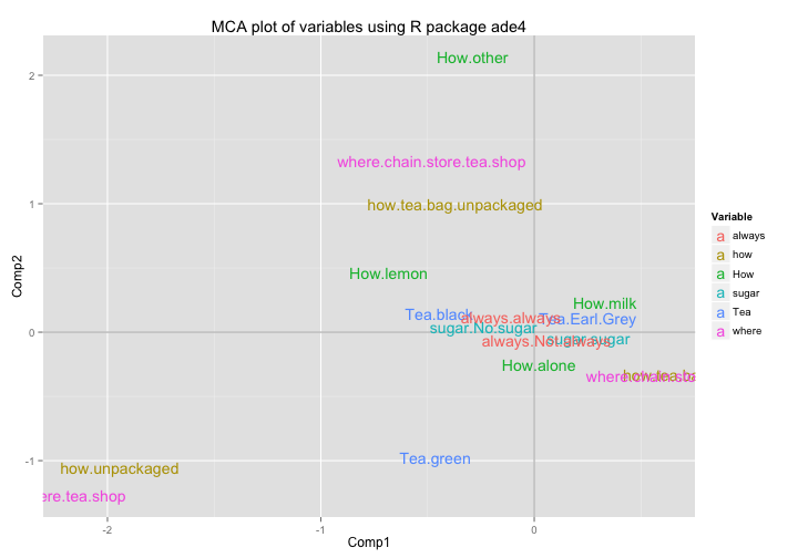
Option 4: using mjca()
Another interesting way for carrying out MCA is by using the function mjca() from the package "ca" by Michael Greenacre and Oleg Nenadic.
# PCA with function mjca
require(ca)

# apply mjca
mca4 = mjca(newtea, lambda = "indicator", nd = 5)

# eigenvalues
mca4$sv^2
## [1] 0.27976 0.25775 0.22014 0.18793 0.16876 0.16369 0.15289 0.13839
## [9] 0.11569 0.08613 0.06221# column coordinates
head(mca4$colcoord)## [,1] [,2] [,3] [,4] [,5] [,6] [,7] [,8]
## [1,] -0.84293 0.2825 2.4025 -1.7021 0.4199 -0.3094 -0.7239 0.6186
## [2,] 0.47324 0.2195 -1.0234 0.1611 -0.1910 -0.4697 -0.4730 -0.3718
## [3,] -0.87755 -1.9175 0.5980 2.8748 0.1756 3.4406 4.3895 0.7871
## [4,] 0.04138 -0.4947 0.2201 1.0550 -0.5676 -0.8043 -0.2693 -0.5657
## [5,] -1.29002 0.9138 -2.7015 -2.3112 -2.8495 1.2491 0.1538 4.7051
## [6,] 0.62577 0.4502 0.1480 -1.4777 3.2767 2.6284 -0.5791 -0.5741
## [,9] [,10] [,11]
## [1,] 2.6024 0.17604 0.9394
## [2,] -1.0592 -0.38620 -0.3016
## [3,] 0.3589 1.86396 -0.3425
## [4,] 0.4204 0.23138 0.4805
## [5,] 0.4171 0.08123 -1.1769
## [6,] -0.9544 -0.48444 -0.5622# row coordinates
head(mca4$rowcoord)## [,1] [,2] [,3] [,4] [,5] [,6] [,7] [,8]
## [1,] 0.6180 -0.5717 0.8123 -0.9365 -0.5706 -0.2387 -0.06383 -0.3996
## [2,] 0.5089 -0.2085 1.7044 -1.2840 1.0391 1.1337 -0.87521 0.5964
## [3,] 0.7395 -0.5394 0.5131 0.4061 -0.7684 -0.3465 -0.63620 0.1565
## [4,] 1.0327 -0.5923 -0.4046 -0.2201 -0.8185 -0.3048 0.04315 -0.8433
## [5,] 0.6403 -0.4235 -0.0691 0.8653 0.5820 -1.3092 -0.42242 1.0691
## [6,] 0.7395 -0.5394 0.5131 0.4061 -0.7684 -0.3465 -0.63620 0.1565
## [,9] [,10] [,11]
## [1,] 1.87979 0.25331 1.153553
## [2,] 0.01721 -0.30176 0.086183
## [3,] -1.10331 -0.21454 -0.046316
## [4,] 0.08561 -0.06599 0.324294
## [5,] -0.65316 0.18058 0.006424
## [6,] -1.10331 -0.21454 -0.046316We’ll use the column coordinates colcoord to make a data frame and pass it to ggplot():
# data frame for ggplot
mca4_vars_df = data.frame(mca4$colcoord, Variable = rep(names(cats), cats))
rownames(mca4_vars_df) = mca4$levelnames

# plot
ggplot(data = mca4_vars_df,
       aes(x = X1, y = X2, label = rownames(mca4_vars_df))) +
  geom_hline(yintercept = 0, colour = "gray70") +
  geom_vline(xintercept = 0, colour = "gray70") +
  geom_text(aes(colour = Variable)) +
  ggtitle("MCA plot of variables using R package ca")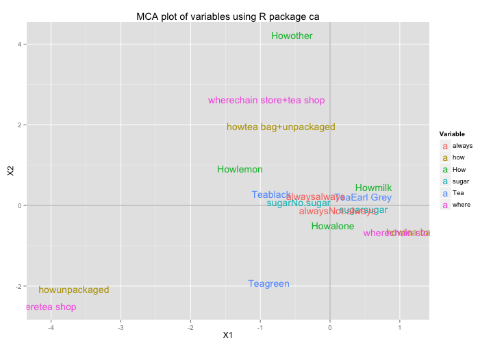
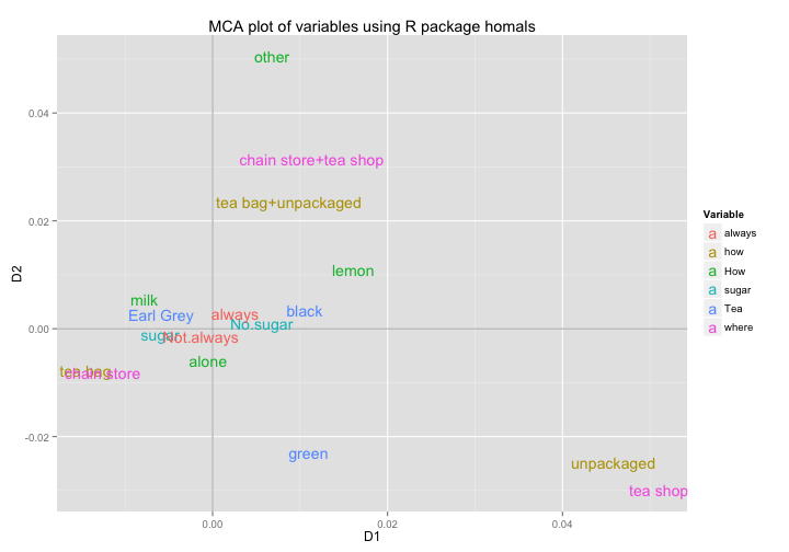
Option 5: using homals()
A fifth possibility is the homals() function from the package "homals" by Jan de Leeuw and Patrick Mair.
# CA with function corresp
require(homals)

# apply homals
mca5 = homals(newtea, ndim = 5, level = "nominal")

# eigenvalues
mca5$eigenvalues
## [1] 0.02331 0.02148 0.01834 0.01566 0.01405# column coordinates
mca5$catscores## $Tea
## D1 D2 D3 D4 D5
## black 0.010507 0.003388 -0.026569 -0.017393 -0.003410
## Earl Grey -0.005902 0.002623 0.011318 0.001646 0.002682
## green 0.010955 -0.022939 -0.006613 0.029374 -0.008038
##
## $How
## D1 D2 D3 D4 D5
## alone -0.0005122 -0.005920 -0.002434 0.01078 0.006872
## lemon 0.0160756 0.010945 0.029875 -0.02361 0.024779
## milk -0.0078048 0.005382 -0.001637 -0.01511 -0.035961
## other 0.0067866 0.050458 -0.045354 -0.04129 0.011981
##
## $how
## D1 D2 D3 D4 D5
## tea bag -0.014523 -0.007774 -0.001527 -0.005628 0.0005400
## tea bag+unpackaged 0.008722 0.023588 0.001330 0.015138 -0.0002901
## unpackaged 0.045806 -0.024877 0.003735 -0.012950 -0.0017924
##
## $sugar
## D1 D2 D3 D4 D5
## No.sugar 0.005606 0.0009363 -0.01381 0.008044 -0.0004736
## sugar -0.005993 -0.0010009 0.01476 -0.008599 0.0005063
##
## $where
## D1 D2 D3 D4 D5
## chain store -0.01257 -0.008094 -0.003299 0.0001402 0.0005466
## chain store+tea shop 0.01131 0.031415 0.003057 0.0024093 0.0009563
## tea shop 0.05103 -0.029878 0.013167 -0.0071612 -0.0059849
##
## $always
## D1 D2 D3 D4 D5
## always 0.002574 0.002777 0.011901 0.008008 -0.017946
## Not.always -0.001346 -0.001452 -0.006222 -0.004187 0.009383# row coordinates
head(mca5$objscores)## D1 D2 D3 D4 D5
## 1 -0.01456 -0.013483 -0.019147 -0.022069 0.014290
## 2 -0.01199 -0.004923 -0.040173 -0.030272 -0.029165
## 3 -0.01742 -0.012725 -0.012093 0.009576 0.019355
## 4 -0.02433 -0.013977 0.009537 -0.005183 0.020316
## 5 -0.01509 -0.009991 0.001629 0.020390 -0.007502
## 6 -0.01742 -0.012725 -0.012093 0.009576 0.019355In order to get the MCA plot of variables, we first need to unlist the coordinates of the categories before creating the data frames for ggplot():
# data frame for ggplot
D1 = unlist(lapply(mca5$catscores, function(x) x[,1]))
D2 = unlist(lapply(mca5$catscores, function(x) x[,2]))

mca5_vars_df = data.frame(D1 = D1, D2 = D2, Variable = rep(names(cats), cats))
rownames(mca5_vars_df) = unlist(sapply(mca5$catscores, function(x) rownames(x)))

# plot
ggplot(data = mca5_vars_df,
       aes(x = D1, y = D2, label = rownames(mca5_vars_df))) +
  geom_hline(yintercept = 0, colour = "gray70") +
  geom_vline(xintercept = 0, colour = "gray70") +
  geom_text(aes(colour = Variable)) +
  ggtitle("MCA plot of variables using R package homals")