18 Simple Features Maps
In the preceding chapter we described a fairly basic way to make maps of storms
with packages "maps" and "ggplot2". While this approach may let us get the
job done for simple maps, one of its main limitations has to do with
the distortions caused when zooming-in to certain areas of a given map.
A better approach to make maps of storm locations with "ggplot2" is to use it
jointly with the packages "sf" (simple features) and "rnaturalearth".
Instead of using maps data sets from "maps" we are going to use maps from
"rnaturalearth". And instead of using the geom_polygon() layer, we are
going to use the geom_sf() layer.
The code in this chapter requires the following packages:
library(tidyverse)        # for syntactic manipulation of tables
library(sf)               # provides classes and functions for vector data
library(rnaturalearth)    # map data from Natural Earth
library(plotly)           # interactive plots
and the following table for storms in 1975:
storms75 <- filter(storms, year == 1975)18.1 Basic World Map
Like we did it in the previous chapter, let’s start with a basic world map.
"rnaturalearth" provides a couple of world maps:
world coastline map, returned by
ne_coastline()world country polygons, returned by
ne_countries()
18.1.1 World Coastline Map
One very simple world map involves the coastline map. As mentioned above,
this map is returned by the ne_coastline() function. In the following command,
we specify a medium scale resolution, and a returned object of class "sf".
# natural earth world coastline
world_coast = ne_coastline(scale = "medium", returnclass = "sf")

class(world_coast)
## [1] "sf" "data.frame"Because we are going use the geom_sf() layer, it is important to specify the
argument returnclass = "sf" so that we obtain an object of class "sf". This
kind of object is a simple features object, but it’s also a data frame
suitable for ggplot().
We pass world_coast to ggplot(), and use geom_sf() which is the
function that allows us to visualize simple features objects "sf".
ggplot(data = world_coast) +
  geom_sf()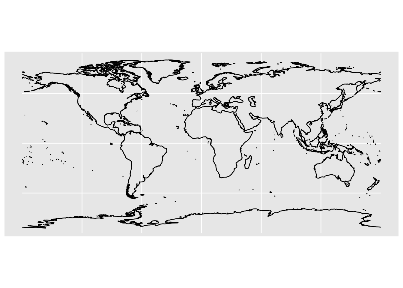
18.1.2 World Countries Map
Another world map involves the countries map. The data for this map is
returned by ne_countries(). Like in the previous example, make sure you
set the argument returnclass = "sf" to get a simple features tabular object
that is also a data.frame:
# natural earth world country polygons
world_countries = ne_countries(returnclass = "sf")

ggplot(data = world_countries) +
  geom_sf()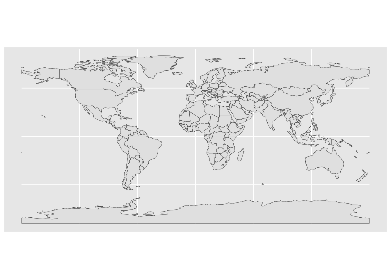
When making maps with ggplot() I like to modify the background to obtain
simpler and cleaner visualizations. One option to do this is with the
theme() function:
ggplot(data = world_countries) +
  geom_sf() +
  theme(panel.background = element_blank())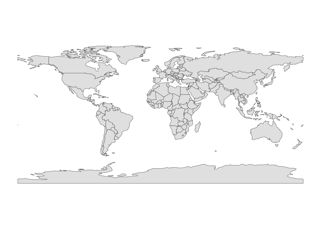
One of the nice aspects of "rnaturalearth" maps is that we can zoom-in
without having distorted polygons. To focus on a specific region, we set the
x-axis and y-axis limits with the coord_sf() function, for example:
ggplot(data = world_countries) +
  geom_sf() +
  coord_sf(xlim = c(-110, 0), ylim = c(5, 65)) +
  theme(panel.background = element_blank())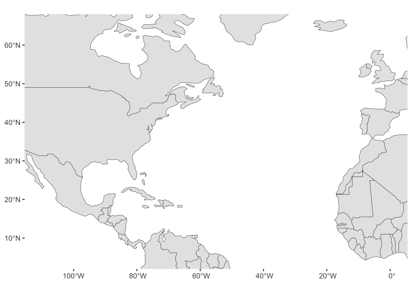
18.1.3 North America Map
Similarly, the ne_countries() function lets you obtain polygons data for
a certain continent of the world: e.g. "Europe", "Africa", "Asia",
"North America", "South America", "Oceania", etc.
# natural earth world country polygons in North America
north_america = ne_countries(continent = "North America", returnclass = "sf")

ggplot(data = north_america) +
  geom_sf() +
  theme(panel.background = element_blank())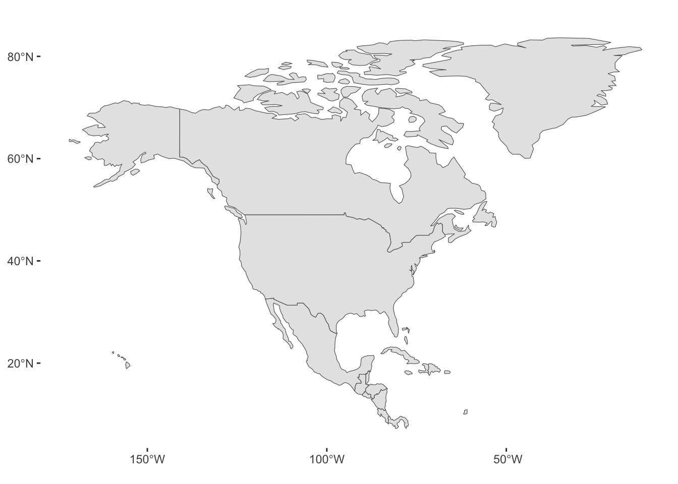
18.2 Plotting Storms
Now that we know how to get polygons from natural earth, and how to plot
them—via ggplot()—with geom_sf() and coord_sf(), let’s add the
longitude and latitude locations of storms in 1975.
Because the storm locations come from the tibble storms75, we pass this
data to geom_point()
ggplot(data = north_america) +
  geom_sf() +
  geom_point(data = storms75,
             aes(x = long, y = lat, group = name)) +
theme(panel.background = element_blank()) 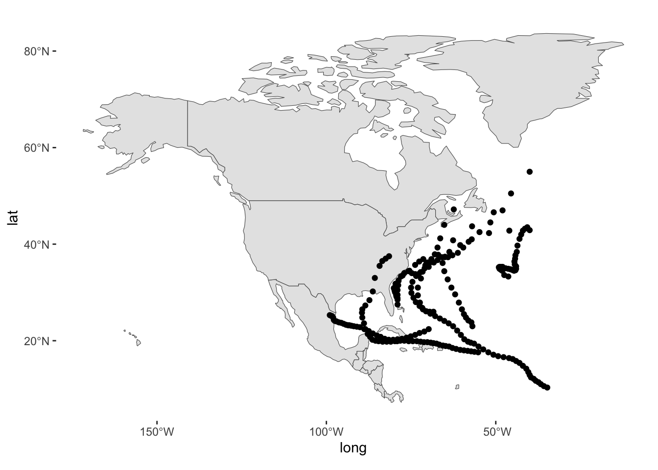
Instead of points, we can connect the locations with lines through geom_path()
ggplot(data = north_america) +
  geom_sf() +
  geom_path(data = storms75,
             aes(x = long, y = lat, group = name)) +
theme(panel.background = element_blank()) 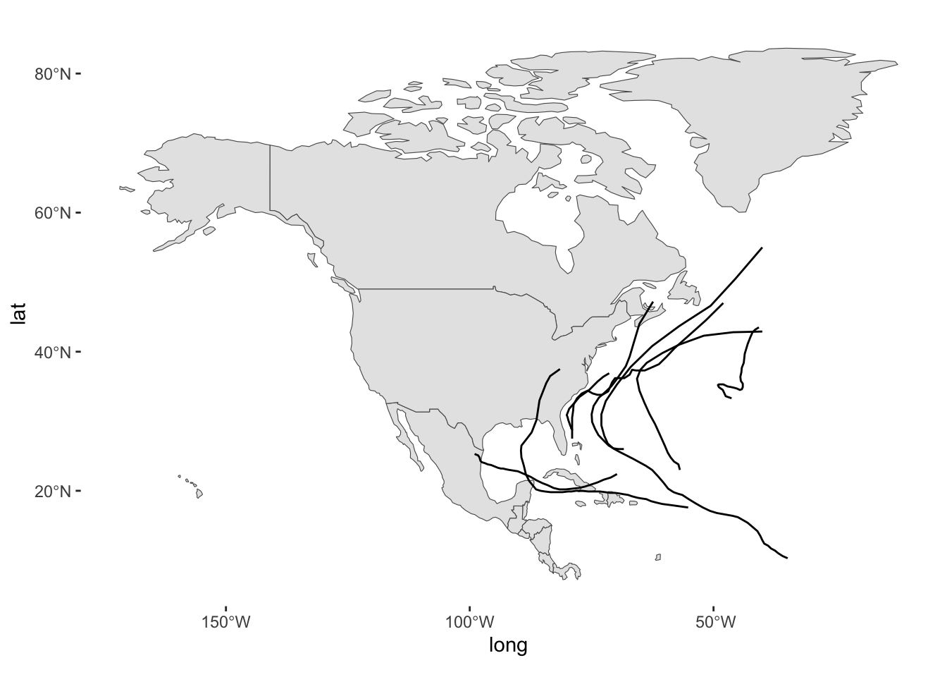
And then enhance it with colors mapping the name column to the color
aesthetic of geom_path():
ggplot(data = north_america) +
  geom_sf() +
  geom_path(data = storms75,
            aes(x = long, y = lat, group = name, color = name)) +
theme(panel.background = element_blank()) 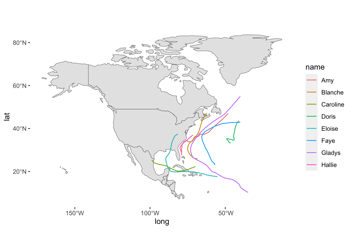
Interactive map with ggplotly()
For your amusement, you can take a ggplot object and pass it to ggplotly()
in order to get an interactive map:
gg = ggplot(data = north_america) +
  geom_sf() +
  geom_path(data = storms75,
             aes(x = long, y = lat, group = name, color = name)) +
  theme(panel.background = element_blank())

ggplotly(gg)
18.2.1 Hurricanes in 1975
Hurricanes in 1975
hurricanes75 = storms75 |>
  filter(wind >= 64)
We’ll use hurricanes75 to super impose their longitude and latitude
coordinates onto the world_countries map:
ggplot(data = world_countries) +
  geom_sf() +
  geom_path(
    data = hurricanes75,
    aes(x = long, y = lat, group = name, color = name, linewidth = wind),
    lineend = "round", alpha = 0.6) +
  coord_sf(xlim = c(-110, 0), ylim = c(5, 65), expand = FALSE) +
  theme(panel.background = element_blank()) +
  labs(title = "Hurricanes in 1975")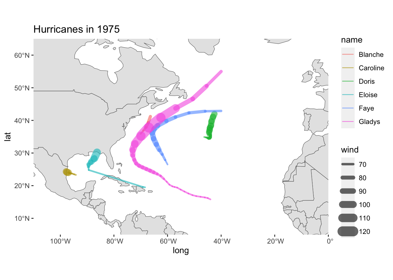
A slightly more curated map
ggplot(data = world_countries) +
  geom_sf(fill = "#FFFBED") +
  geom_path(
    data = hurricanes75,
    aes(x = long, y = lat, group = name, color = name, linewidth = wind),
    lineend = "round", alpha = 0.6) +
  coord_sf(xlim = c(-110, 0), ylim = c(5, 65), expand = FALSE) +
  theme(panel.background = element_rect(fill = "aliceblue")) +
  labs(title = "North Atlantic Hurricanes",
       subtitle = "Season 1975")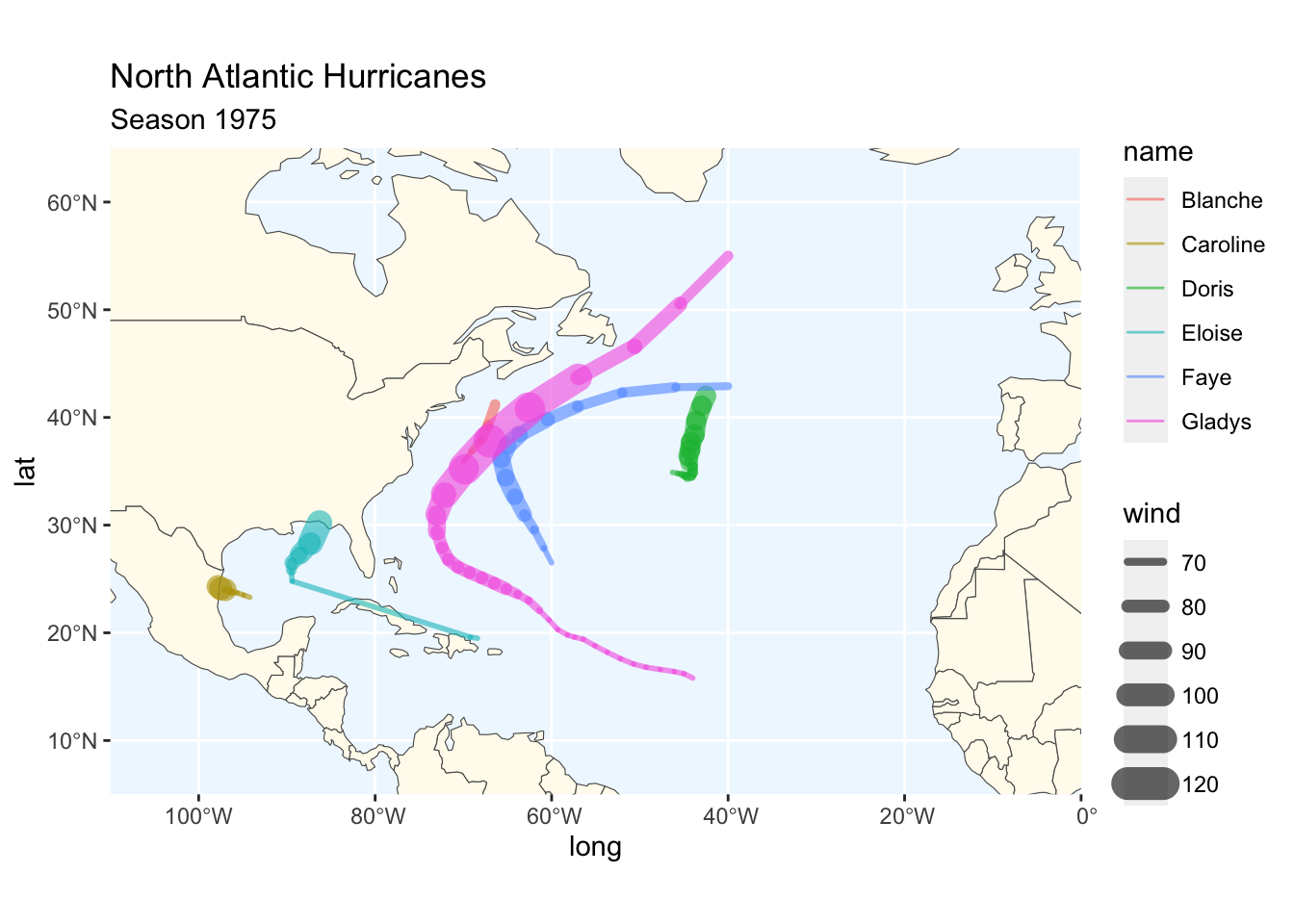
18.3 More Maps
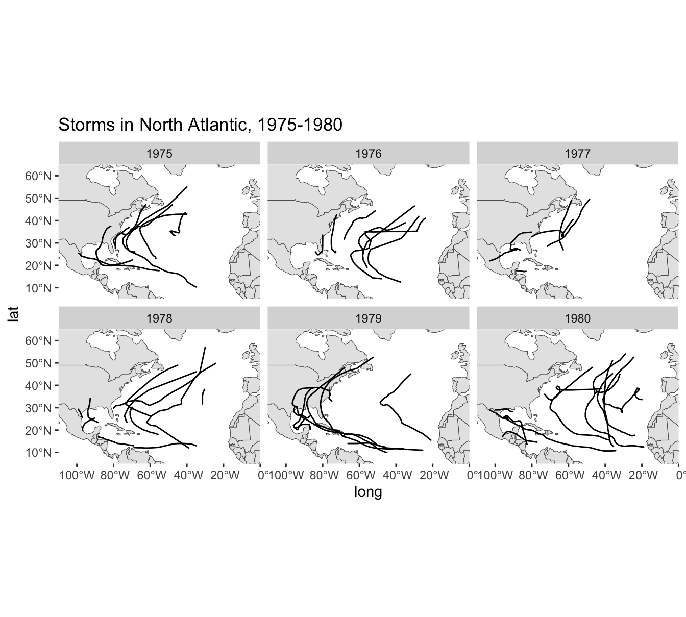
As a simple experiment, let’s graph storms between 1975 and 1980 (six years).
First we create a dedicated data table storms_set to select the rows we are
interested in:
# 2nd map (coloring storms individually)
which_years = 1975:1980

# Subset storms (for a given year)
storms_set = storms |>
  filter(year %in% which_years)
And then we can use facet_wrap(~ year) to graph storms by year:
ggplot(data = world_countries) +
  geom_sf() +
  coord_sf(xlim = c(-110, 0), ylim = c(5, 65), expand = FALSE) +
  geom_path(data = storms_set,
             aes(x = long, y = lat, group = name),
             lineend = "round") +
  theme(panel.background = element_blank()) +
  facet_wrap(~ year) +
  labs(title = "Storms in North Atlantic, 1975-1980")