7 Inspecting Single Columns
As we just saw, because storms is an object of class "tibble", when you
type its name R displays the first 10 rows, which belong to storm Amy in 1975:
storms## # A tibble: 19,066 × 13
## name year month day hour lat long status category wind pressure
## <chr> <dbl> <dbl> <int> <dbl> <dbl> <dbl> <fct> <dbl> <int> <int>
## 1 Amy 1975 6 27 0 27.5 -79 tropical d… NA 25 1013
## 2 Amy 1975 6 27 6 28.5 -79 tropical d… NA 25 1013
## 3 Amy 1975 6 27 12 29.5 -79 tropical d… NA 25 1013
## 4 Amy 1975 6 27 18 30.5 -79 tropical d… NA 25 1013
## 5 Amy 1975 6 28 0 31.5 -78.8 tropical d… NA 25 1012
## 6 Amy 1975 6 28 6 32.4 -78.7 tropical d… NA 25 1012
## 7 Amy 1975 6 28 12 33.3 -78 tropical d… NA 25 1011
## 8 Amy 1975 6 28 18 34 -77 tropical d… NA 30 1006
## 9 Amy 1975 6 29 0 34.4 -75.8 tropical s… NA 35 1004
## 10 Amy 1975 6 29 6 34 -74.8 tropical s… NA 40 1002
## # ℹ 19,056 more rows
## # ℹ 2 more variables: tropicalstorm_force_diameter <int>,
## # hurricane_force_diameter <int>From this output, it is obvious that the data contains at least one storm from 1975. But what other year values are present in the data?
According to the manual documentation of storms ("dplyr" version 1.0.10):
"The data includes the positions and attributes of storms from 1975-2020"
In a more or less arbitrary way, let’s begin inspecting storms by focusing
on column year.
7.1 Basic Inspection of Year
Let’s formalize our first exploratory question:
What years have the data been collected for?
To answer this question, we need to work with column year.
There are several ways in R to manipulate a column from a tabular object. Using
"dplyr", there are two basic kinds of functions to extract variables:
pull() and select().
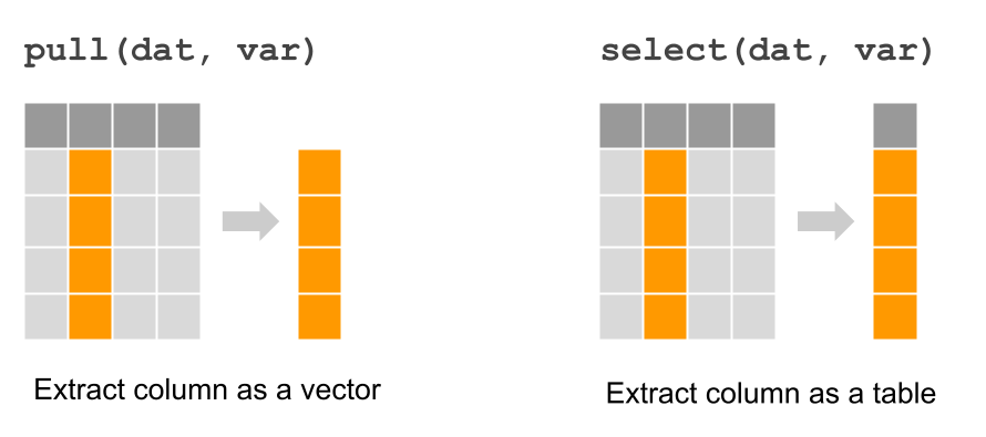
Figure 7.1: Extracting a column with dplyr functions “pull” and “select”
Let’s do a sanity check of years. We can use the function pull() that pulls
or extracts an entire column. Because there are thousands of values in
year, let’s also use unique() to find out the set of year values in the
data. First we pull the year, and then we identify unique occurrences:
unique(pull(storms, year))## [1] 1975 1976 1977 1978 1979 1980 1981 1982 1983 1984 1985 1986 1987 1988 1989
## [16] 1990 1991 1992 1993 1994 1995 1996 1997 1998 1999 2000 2001 2002 2003 2004
## [31] 2005 2006 2007 2008 2009 2010 2011 2012 2013 2014 2015 2016 2017 2018 2019
## [46] 2020 2021Based on this output, we can see that storms has records during a 45-year
period since 1975 to 2020.
The same can be accomplished with unique() and select().
unique(select(storms, year))## # A tibble: 47 × 1
## year
## <dbl>
## 1 1975
## 2 1976
## 3 1977
## 4 1978
## 5 1979
## 6 1980
## 7 1981
## 8 1982
## 9 1983
## 10 1984
## # ℹ 37 more rowsCan you notice the difference between pull() and select()? The difference
is minor but important. Conceptually speaking, both functions return the same
values. However, the format of their output is not the same. Observe that
select() returns output in a tibble format. In contrast, the output of
pull() is not in a tabular format but rather in a vector (i.e. contiguous
set of values).
Interestingly, there is a third option that can be used to find the unique
or distinct year values: using the function distinct()
distinct(storms, year)## # A tibble: 47 × 1
## year
## <dbl>
## 1 1975
## 2 1976
## 3 1977
## 4 1978
## 5 1979
## 6 1980
## 7 1981
## 8 1982
## 9 1983
## 10 1984
## # ℹ 37 more rowsAgain, notice the tabular output returned by distinct().
7.1.1 Barplot of year values
Let’s keep using the values in column year to obtain our first visualization
with "ggplot2" functions. You could certainly begin a visual exploration of
other variables, but I think year is a good place to start because it’s a
numeric variable, measured on a discrete scale, and this is a good candidate
to use barcharts (the most popular type of graphic).
"ggplot2" comes with a large number of functions to create almost any
type of chart. Luckily for us, it already comes with predefined
functions to graph barcharts. The syntax may seem a bit scary for beginners,
but you will see that it follows a logical structure. Here’s the code to make
a barplot of values in year:
# barchart of year values
ggplot(data = storms) +
  geom_bar(aes(x = year))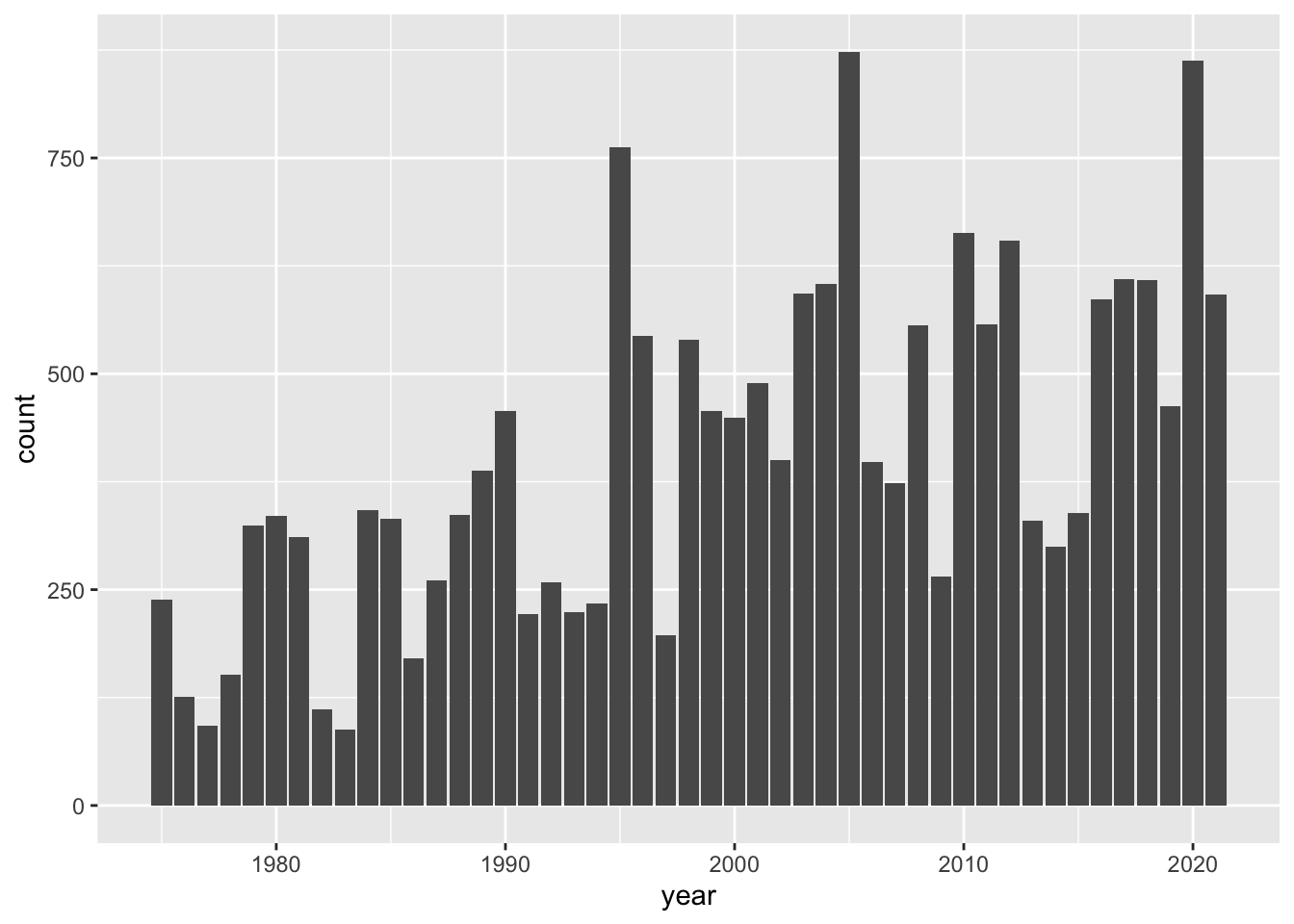
How does the previous command work?
First, we always call the
ggplot()function, typically indicating the name of the table to be used with thedataargument.Then, we add more components, or layers, using the plus
+operator.In this case we are adding just one layer: a
geom_bar()component which is the geometric object for bars.To tell
ggplot()thatyearis the column indata = stormsto be used for the x-axis, we mapx = yearinside theaes()function which stands for aesthetic mapping.
We should clarify that the meaning of “aesthetic” as used by "ggplot2" does
not mean beautiful or pretty, instead it conserves its etymological
meaning of perception. Simply put, aes() is the function that you use to
tell ggplot() which variables of a data object will be mapped as visual
attributes of graphical elements.
7.2 Basic inspection of month
Now that we have explored column year, we can move to the column month
and perform similar type of analysis. Using the same commands, all we have to
do is change the name of the variable to month to see whether there are
storms in all months:
unique(pull(storms, month))## [1] 6 7 8 9 10 11 5 12 4 1In this case, it would be better if we sort() them:
sort(unique(pull(storms, month)))## [1] 1 4 5 6 7 8 9 10 11 12Observe that not all months have recorded storms, this is the case for February (2) and March (3). Is this something to be concerned about? How is it possible that there are no recorded data for February and March? For the inexperience analyst, asking this type of questions is fundamental. As a data scientist, you will be working with data sets for which you are not necessarily an expert in that particular field of application. Since you will also be interacting with some type of experts, you should ask them as many questions as possible to clarify your understanding of the data and its context.
The answer for not having storms in February and March is because these months have to do with the end of Winter and beginning of Spring in the North Atlantic, which is a period of time where tropical systems don’t get formed. In fact, Spring months such as April and May also don’t tend to be typical months for hurricanes. So a further thing to explore could involve computing the number of storms in April and May.
7.3 Exercises
1) Use pull(), select(), and unique() to inspect the values in column
day
2) Try to use sort() in order to arrange the unique values of day
3) Does the unique day values make sense? Are there days for which there seem to be no recorded storm data?
4) Use "ggplot2" functions to graph a barchart for the values in columns
month.
5) Use "ggplot2" functions to graph a barchart for the values in columns
day.
6) Look at the cheatsheet for ggplot and locate the information for geom_bar().
Find out how to specify: border color, fill color. Also, see what happens
when you specify alpha = 0.5.
7) Look at the cheatsheet for ggplot and locate the information for background
Themes, e.g. theme_bw(). Find out how to add theme theme_classic() to the
previous barchart.
8) Look at the cheatsheet for ggplot and locate the information for Labels.
Find out how to add a title with ggtitle() as well as with labs() to one
of your previous barcharts.