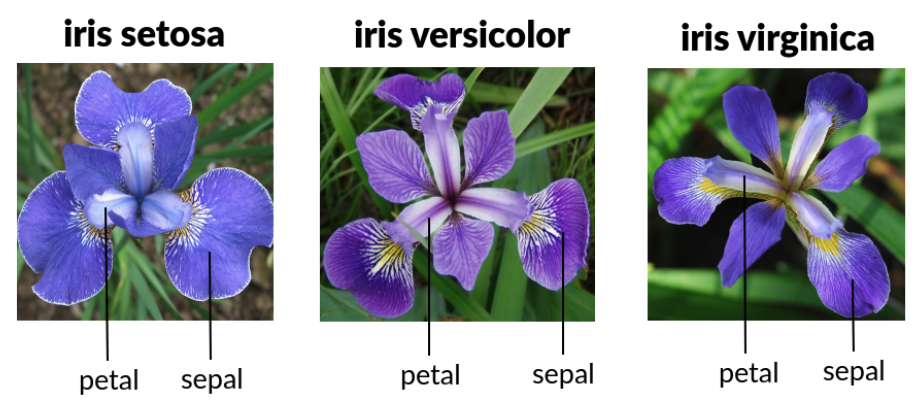
We are going to use the famous iris data set which is a built-in data frame in R. This data set contains petal and sepal measurements of iris flowers from three different species (see image below).
# f) boxplots of Sepal.Length (x) by Species (y)ggplot(data = ______,mapping =aes(x = ______________, y = ______________)) +geom_____________()
Show answer
ggplot(data = iris,mapping =aes(x = Sepal.Length, y = Species)) +geom_boxplot()
Boxplots of Sepal.Length (y) by Species (x)
# g) boxplots of Sepal.Length (y) by Species (x)ggplot(data = ______,mapping =aes(x = ______________, y = ______________)) +geom_____________()
Show answer
ggplot(data = iris,mapping =aes(x = Species, y = Sepal.Length)) +geom_boxplot()
Density plots of Sepal.Length, color-filled (fill) by Species
# h) density plots of Sepal.Length, color-filled (fill) by Speciesggplot(data = ______,mapping =aes(x = ______________,fill = ____________)) +geom___________()
Show answer
ggplot(data = iris,mapping =aes(x = Sepal.Length, fill = Species)) +geom_density()
3) Settings -vs- Mappings
In the Grammar of Graphics, it is important to understand the difference between a mapping and a setting. Recall that a setting is when you set or fix the value of a visual attribute to a constant or a value that does NOT come from the data frame.
Histogram of Sepal.Length, filling the bars in "orange" (fill) and changing the color of the bar borders to "white" (color)
# a) histogram of Sepal.Length, filling the bars in "orange" (fill)# and changing the color of the bar borders to "white" (color)ggplot(data = ______,mapping =aes(x = ______________)) +geom____________(fill = _______, color = _________)
Show answer
ggplot(data = iris,mapping =aes(x = Sepal.Length)) +geom_histogram(fill ="orange", color ="white")
Scatter plot of Sepal.Length (x) and Sepal.Width (y) coloring points in "red" (color) change size of points to 3 (size)
# b) scatter plot of Sepal.Length (x) and Sepal.Width (y)# coloring points in "red" (color) # change size of points to 3 (size)ggplot(data = ______,mapping =aes(___ = _____________, ___ = _____________)) +geom__________(color = ________, size = ___)
Bar plot of Species from a random sample of 40 flowers filling color of bars to "turquoise".
# c) bar plot of Species from a random sample of 40 flowers# filling color of bars to "turquoise"set.seed(246)iris_sample =slice_sample(iris, n =40, replace =TRUE)ggplot(data = ____________,mapping =aes(x = _________)) +geom__________(fill = ________)
Show answer
# random sample of 40 flowersset.seed(246)iris_sample =slice_sample(iris, n =40, replace =TRUE)ggplot(data = iris_sample,mapping =aes(x = Species)) +geom_bar(fill ="turquoise")
3) Labels, Annotations and Themes
Choose two numerical variables from iris and graph a scatter plot, set the color of points to "blue", and add the following:
title
x-axis label
y-axis label
# a) scatterplot, set color of points to "blue"# adding title and axis labelsggplot(data = ______,mapping =aes(___ = _____________, ___ = _____________)) +geom____________(color = _____) +labs(title = __________,x = __________,y = __________)
Show answer
ggplot(data = iris,mapping =aes(x = Sepal.Length, y = Sepal.Width,color = Species)) +geom_point() +labs(title ="Relationship between Sepal Length and Sepal Width",x ="Sepal Length",y ="Sepal Width")
Choose a different pair of numerical variables from iris and graph another scatter plot, color coding points by Species, and add a text annotation to highlight something interesting or unusual in the plot.
# b) scatterplot, coloring (color) points by Species,# adding an annotationggplot(data = ______,mapping =aes(___ = _____________, ___ = _____________,_____ = _____________)) +geom____________() +annotate(geom ="text",x = __________,y = __________,label = ___________)
Choose one of your previous two scatter plots and re-graph it but this time using a ggplot theme that it’s different from the default one. Also, add labels and the annotation.