10 Base Graphics
R comes with many functions that let us produce a wide variety of graphics, plots, diagrams, charts, maps, … you name it.
In this chapter we’ll describe the traditional system to produce plots using
functions from the underlying package "graphics".
10.1 Basics of Graphics in R
The package "graphics" is the traditional system; it provides functions for
complete plots, as well as low-level facilities.
Many other graphics packages are built on top of "graphics" like "maps",
"diagram", "pixmap", and many more.
Graphics functions can be divided into two main types:
high-level functions produce complete plots, for example
barplot()hist()boxplot()dotchart()
low-level functions add further output to an existing plot
text()points()lines()legend()- etc
About R graphics:
R
"graphics"follow a static, “painting on canvas” model.Graphics elements are drawn, and remain visible until painted over.
For dynamic and/or interactive graphics, R is limited. However, several packages have been (and continue to be) developed in order to provide more flexibility and interactivity.
10.2 The plot() function
plot() is the most important high-level function in traditional graphics
The first argument to
plot()provides the data to plotThe provided data can take different forms: e.g. vectors, factors, matrices, data frames.
To be more precise,
plot()is a generic functionYou can create your own
plot()method function
In its basic form, we can use plot() to make graphics of:
one single variable
two variables
multiple variables
10.3 Traditional Graphics in R
In the traditional model, we create a plot by first calling a high-level function that creates a complete plot, and then we call low-level functions to add more output if necessary
Consider the data set mtcars (a few rows shown below)
head(mtcars)
                   mpg cyl disp  hp drat    wt
Mazda RX4         21.0   6  160 110 3.90 2.620
Mazda RX4 Wag     21.0   6  160 110 3.90 2.875
Datsun 710        22.8   4  108  93 3.85 2.320
Hornet 4 Drive    21.4   6  258 110 3.08 3.215
Hornet Sportabout 18.7   8  360 175 3.15 3.440
Valiant           18.1   6  225 105 2.76 3.460
                   qsec vs am gear carb
Mazda RX4         16.46  0  1    4    4
Mazda RX4 Wag     17.02  0  1    4    4
Datsun 710        18.61  1  1    4    1
Hornet 4 Drive    19.44  1  0    3    1
Hornet Sportabout 17.02  0  0    3    2
Valiant           20.22  1  0    3    1
Let’s start with a scatterplot of hp (horse power) and mpg (miles per
gallon). Perhaps the most common way to get this graph is with the high-level
function plot()
# simple scatter-plot
plot(mtcars$mpg, mtcars$hp)
We can specify values for its large number of arguments. For instance, we
can set better axis names with xlab and ylab
# x-axis and y-axis labels
plot(mtcars$mpg, mtcars$hp,
     xlab = "miles per gallon",
     ylab = "horsepower")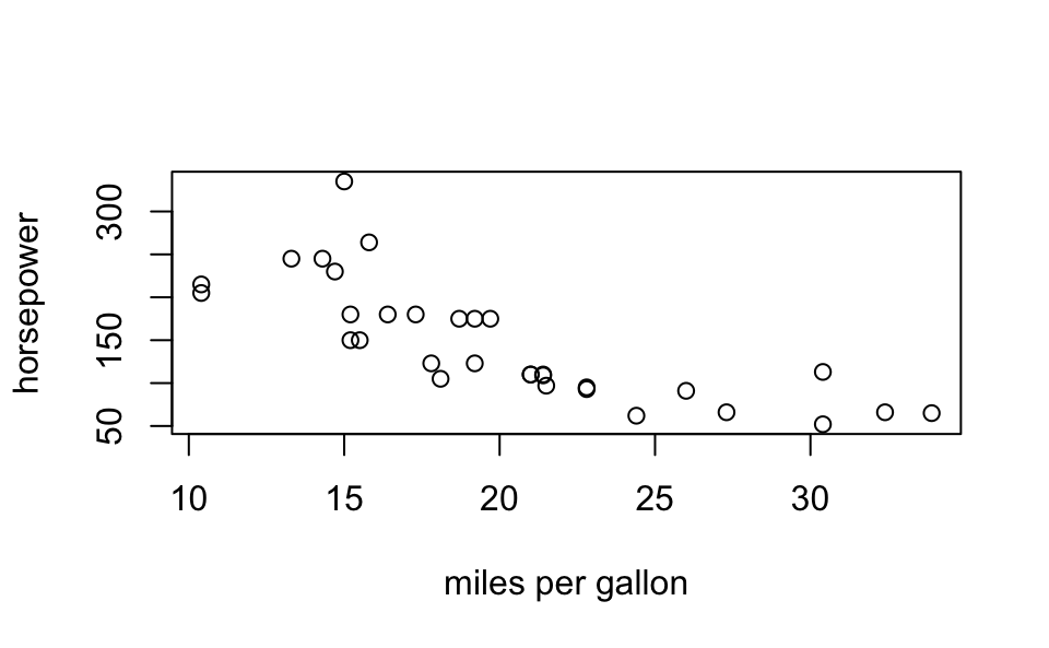
Likewise, we can add a title with the main argument:
# title and subtitle
plot(mtcars$mpg, mtcars$hp,
     xlab = "miles per gallon", ylab = "horsepower",
     main = "Simple Scatterplot", sub = 'data matcars')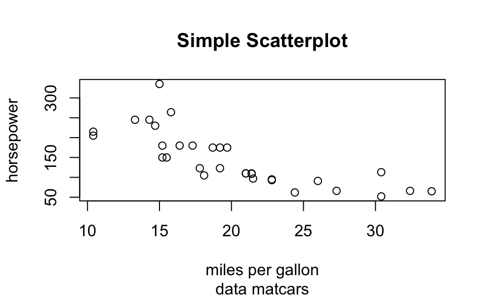
Or we can change the range of x-axis as well as the range of the y-axis
with xlim and ylim, respectively:
# 'xlim' and 'ylim'
plot(mtcars$mpg, mtcars$hp,
     xlab = "miles per gallon", ylab = "horsepower",
     main = "Simple Scatterplot", sub = 'data matcars',
     xlim = c(10, 35), ylim = c(50, 400))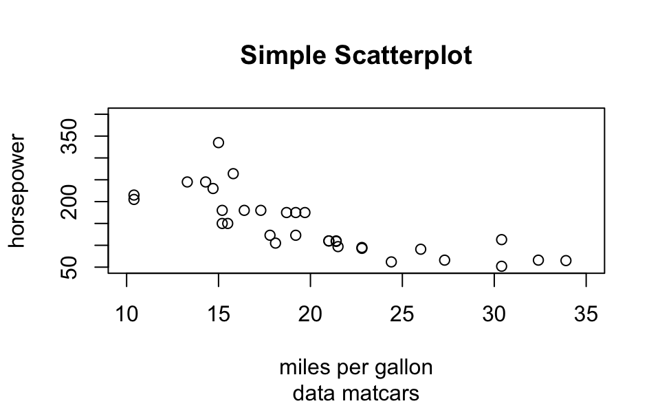
Here’s a more sophisticated example
# using plot()
plot(mtcars$mpg,
     mtcars$hp,
     xlim = c(10, 35),
     ylim = c(50, 400),
     xlab = "miles per gallon",
     ylab = "horsepower",
     main = "Simple Scatterplot",
     sub = "data matcars",
     pch = 1:25,
     cex = 1.2,
     col = "blue")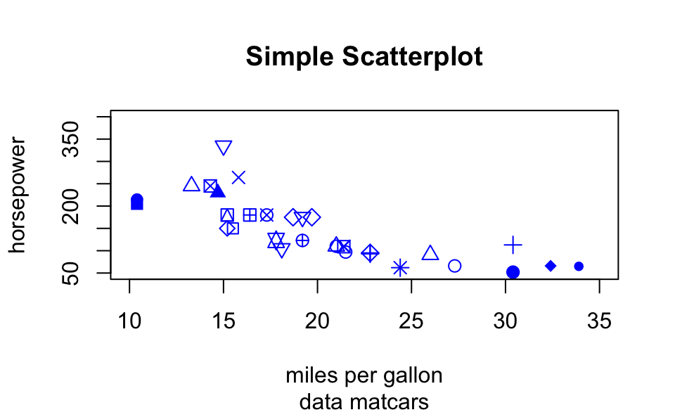
10.4 Low-Level Functions
High and Low level functions
Usually we call a high-level function
Most times we change the default arguments
Then we call low-level functions
Example:
# simple scatter-plot
plot(mtcars$mpg, mtcars$hp)

# adding text
text(mtcars$mpg, mtcars$hp, labels = rownames(mtcars))

# dummy legend
legend("topright", legend = "a legend")

# graphic title
title("Miles Per Galon -vs- Horsepower")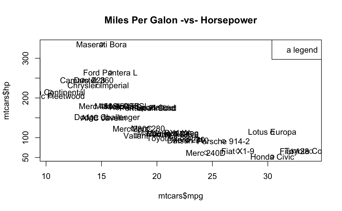
Another example:
# simple scatter-plot
plot(mtcars$mpg, mtcars$hp, type = "n",
     xlab = "miles per gallon", ylab = "horsepower")
# grid lines
abline(v = seq(from = 10, to = 30, by = 5), col = 'gray')
abline(h = seq(from = 50, to = 300, by = 50), col = ' gray')
# plot points
points(mtcars$mpg, mtcars$hp, pch = 19, col = "blue")
# plot text
text(mtcars$mpg, mtcars$hp, labels = rownames(mtcars),
     pos = 4, col = "gray50")
# graphic title
title("Miles Per Galon -vs- Horsepower")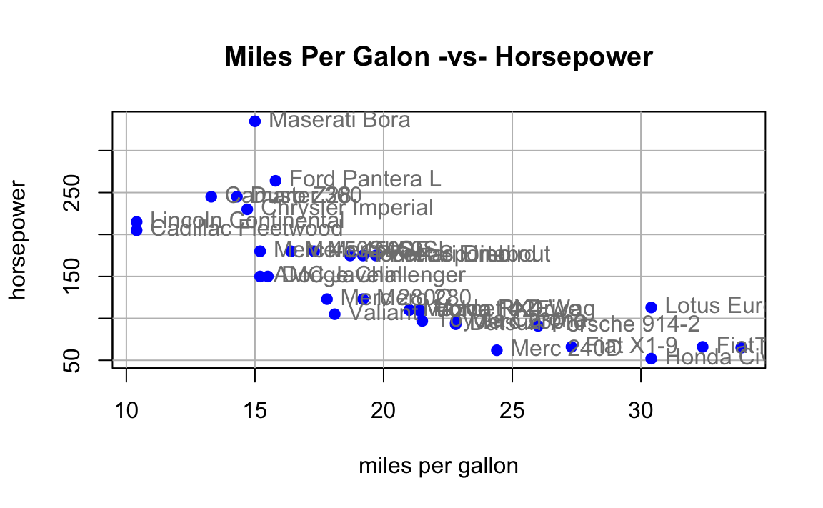
10.4.1 Low-level functions
| Function | Description |
|---|---|
points() |
points |
lines() |
connected line segments |
abline() |
straight lines across a plot |
segments() |
disconnected line segments |
arrows() |
arrows |
rect() |
rectangles |
polygon() |
polygons |
text() |
text |
symbols() |
various symbols |
legend() |
legends |
Lines
x <- 2005:2015

y <- c(81, 83, 84.3, 85, 85.4, 86.5, 88.3,
       88.6, 90.8, 91.1, 91.3)

plot(x, y, type = 'n', xlab = "Time", ylab = "Values")
lines(x, y, lwd = 2)
title(main = "Line Graph Example")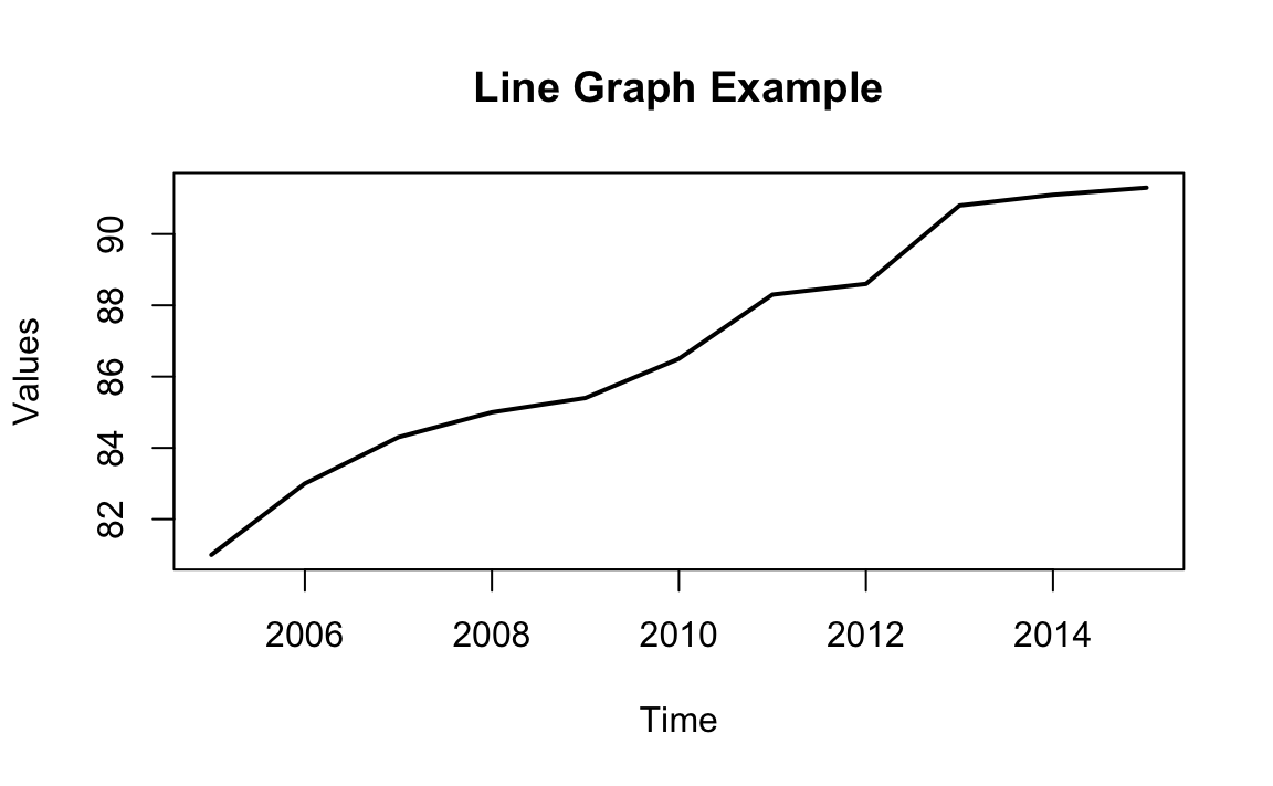
10.4.1.1 Drawing Line Segments
n <- 11
theta <- seq(0, 2 * pi, length = n + 1)[1:n]
x <- sin(theta)
y <- cos(theta)
v1 <- rep(1:n, n)
v2 <- rep(1:n, rep(n, n))

plot(x, y, type = 'n')
segments(x[v1], y[v1], x[v2], y[v2])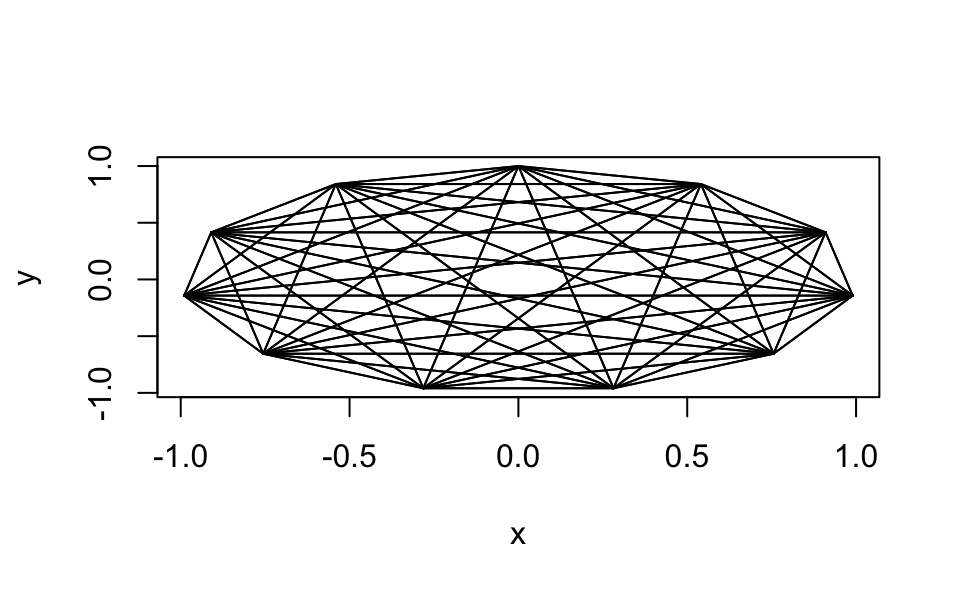
Drawing Polygons
mpg_dens <- density(mtcars$mpg)

plot(mpg_dens, main = "Kernel Density Curve")
polygon(mpg_dens, col = 'gray')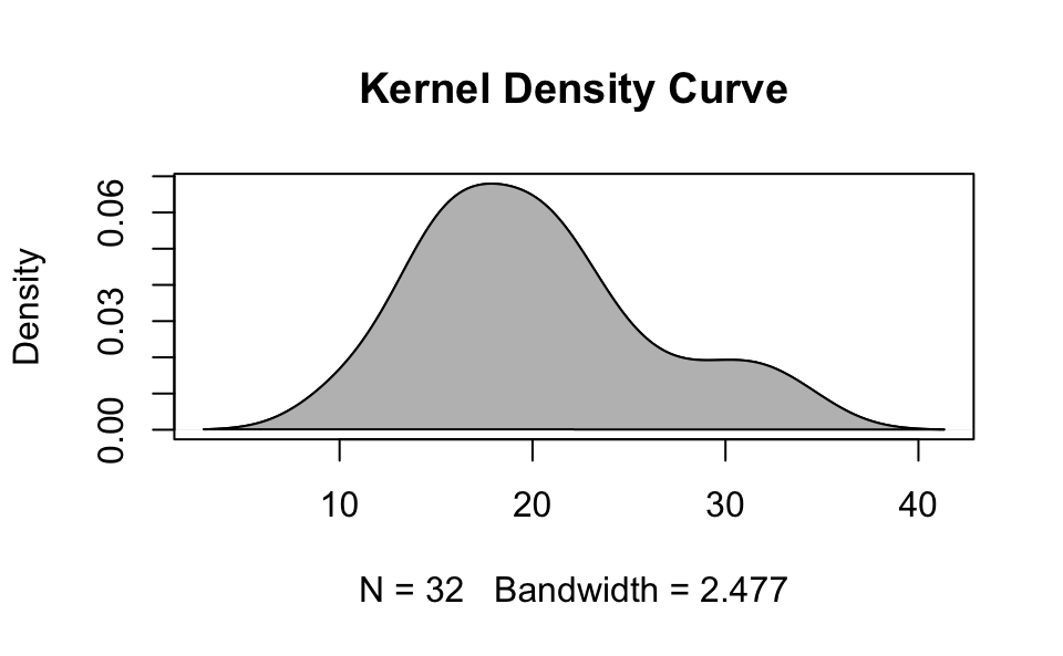
Drawing Text
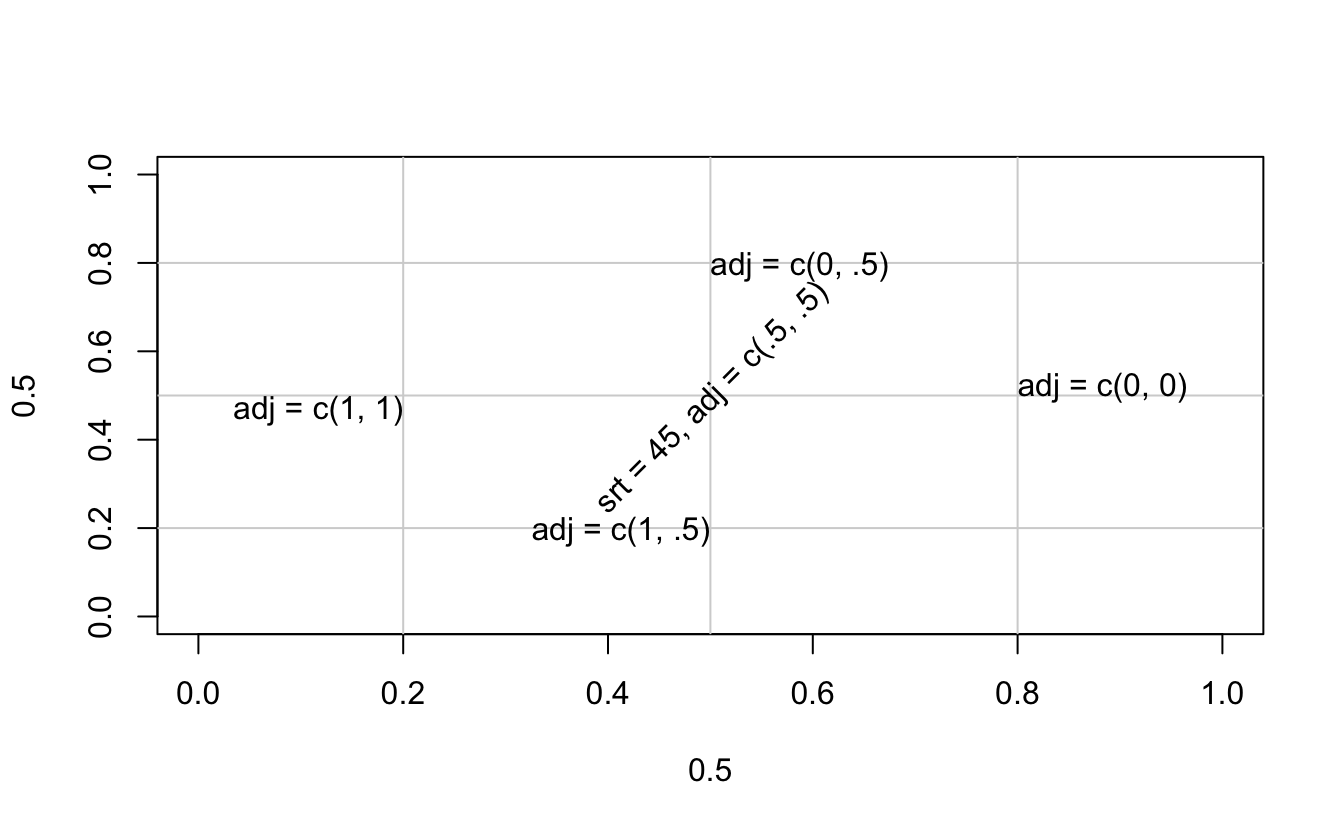
plot(0.5, 0.5, xlim = c(0, 1), ylim = c(0, 1), type = 'n')
abline(h = c(.2, .5, .8),
       v = c(.5, .2, .8), col = "lightgrey")
text(0.5, 0.5, "srt = 45, adj = c(.5, .5)",
     srt = 45, adj = c(.5, .5))
text(0.5, 0.8, "adj = c(0, .5)", adj = c(0, .5))
text(0.5, 0.2, "adj = c(1, .5)", adj = c(1, .5))
text(0.2, 0.5, "adj = c(1, 1)", adj = c(1, 1))
text(0.8, 0.5, "adj = c(0, 0)", adj = c(0, 0))