1 A Tiny Data Analysis
The purpose of this introductory chapter is to perform a super simple analysis. The idea is to play with a small—yet real—data that we’ll use to present some of the basic elements for our mental framework of Data Analysis Projects (DAP).
1.1 Men’s Long Jump World Records
Let’s start with a basic data analysis example involving world records in Athletics for Men’s Long Jump. The data behind this example is freely available in Wikipedia:
https://en.wikipedia.org/wiki/Men%27s_long_jump_world_record_progression
Below is a screenshot of the table as it is displayed in Wikipedia. This table has 19 rows and 5 columns. Each row corresponds to a world record, the first one starting in 1901, and the last one from 1991.
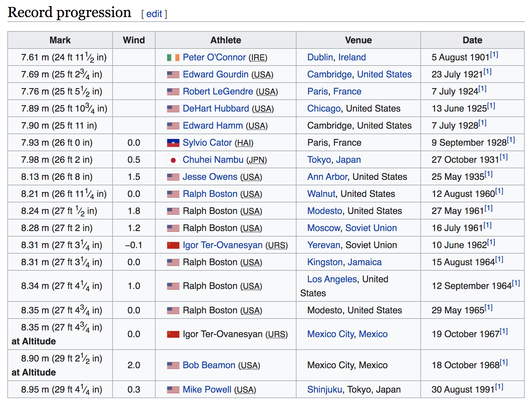
Figure 1.1: Data Table (source: Wikipedia)
The first column Mark contains the record distance expressed in meters, but
also, inside parenthesis, expressed in feet and inches. The second column Wind
shows the wind speed, although the first 5 rows have no data. In order for
a jump to be considered a record, the wind speed has to be less than 3 meters
per second. The next column Athlete contains the name of the athlete and
the abbreviation of his country in parenthesis. Notice that each cell also
has a little icon with the country’s flag. The fourth column is Venue and
it contains the name of the city, and the country where the record was set.
Finally, the last column is Date which displays the date (day month year)
and a superindex link expressed with a number one inside brackets: [1].
In the same Wikipedia page, we also find a simple chart depicting a timeline with the progression of world records over time, like in the image below:
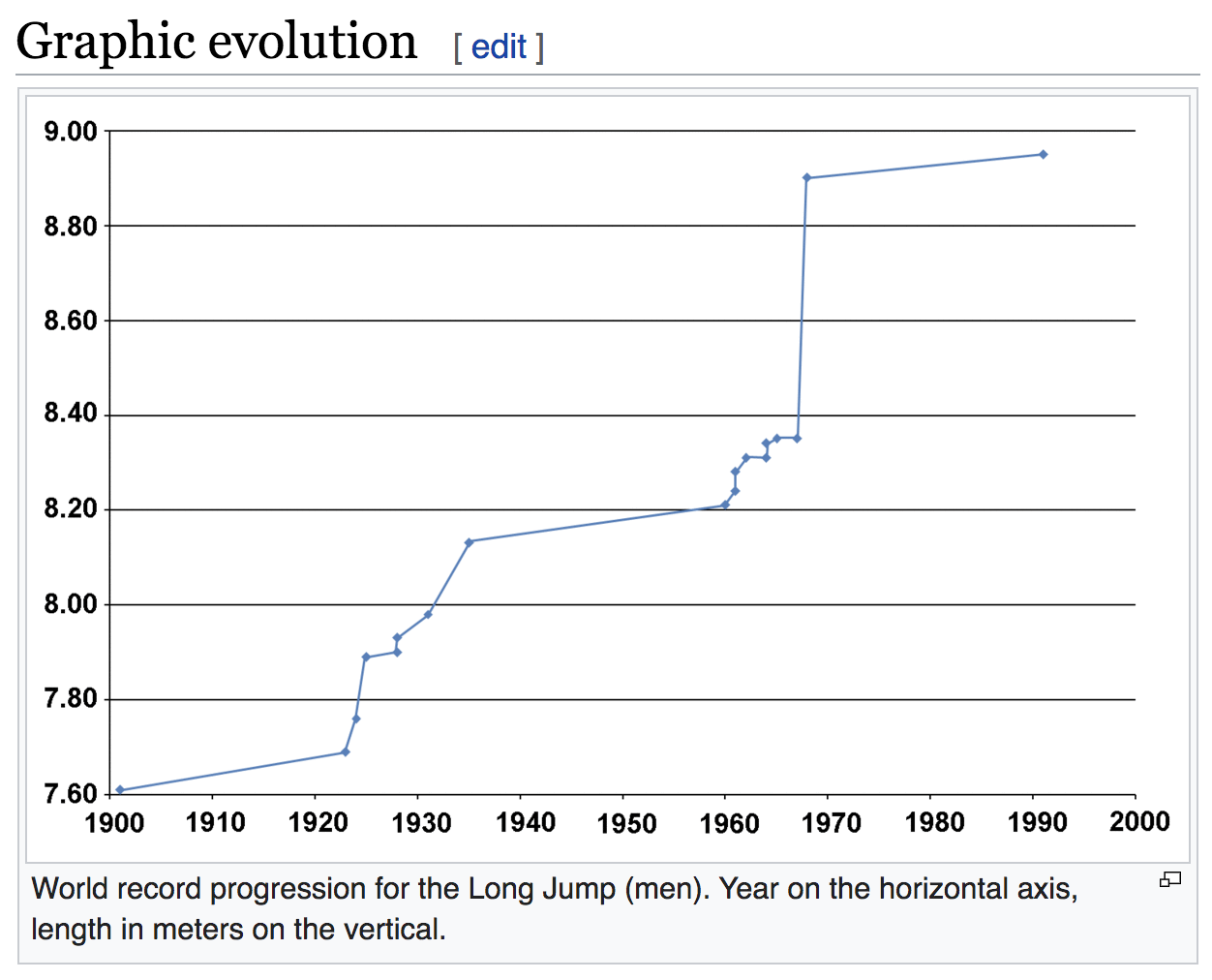
Figure 1.2: Chart showing the progression of world records (source: Wikipedia)
You may not know this, but the current men’s long jump world record is one of the longest standing world records in Athletics. The current record was established by Mike Powell at the 1991 World Championships in Tokyo, with an impressive distance of 8.95 meters! As of this writing (Spring 2020) Powell’s record is about 29 years old. Sports journalist Jonathan Gault has written an interesting opinion on Why is the long jump world record so hard to break?.
Here’s a youtube video with Mike Powell setting the current World Record:
To give you an idea of how impressive the current record is, here’s a diagram depicting the 8.95 m in terms of the average height of a male adult (1.765 m).

Figure 1.3: Mike Powell’s record is equivalent to the average height of 5 male adults
Mike Powell’s jump distance is roughly equivalent to the length of five male adults lying one next to each other. Quite impressive, isn’t?
1.2 What to Analyze?
Pretend you are going to write a sports analytics blog post about men’s long jump world records. To make it more concrete, say you will include a timeline chart to visualize the progression of world records, but you just don’t want to simply copy and paste the chart of Wikipedia. Instead, you want to create your own version (hopefully with a better visual appearance). So the question to consider is:
What would you do to replicate Wikipedia’s timeline graph?
Answering this question implies listing all the steps that you would have to perform in order to graph the chart. To make things more interesting, from a conceptual point of view, let’s tackle this question in a “manual”, or if you prefer, in an analogical way.
What do we mean by this? Let’s forget about computers for a second, and instead do things manually. Yes, we know this text is about computing with data, and we are supposed to teach you how to use computational tools to crunch numbers. But an important part of computing with data involves understanding first what it is that you want to accomplish, and then figure out what to tell the computer (and its programs) to achieve your goals.
What we want you to do is to get scratch paper, and write all the steps that someone needs to take in order to get the right data for the plot. To be more concrete, imagine you have to write a recipe or a list of instructions to one of your friends. By reading those instructions, your friend should be able to “manually” get the data, that later will be used to graph the plot.
What would those steps be? Perhaps something like this:
- look at the table,
- start with the first column named
Mark, - notice how each cell in
Markhas some content: some digits indicating the jumped distance in meters, as well as some digits indicating the distance value in feet and inches, - we just want the digits of the meters, which in this case seem to be the first digit, the decimal point, and the following two digits,
- grab those pieces of data (first four characters) for all cells in column
Mark, - now move on to the last column named
Date, - from this column we want to extract the year values,
- one possible way to do this is to look at the end of the text in each cell,
- the very last characters are the four digits of the year followed by an
annoying superindex
[1], - ignore the annoying
[1], and just keep the four digits forming the year, - use the data in steps 5) and 10) to make the graph,
- more specifically, make a scatterplot with Year in x-axis, and Distance in y-axis,
- etc
Obviously, the list of instructions could be made more or less detailed. But the important part, at least regarding the data, is that we don’t need all the information in the table, we just want some of the pieces in a couple of specific columns, depicted in the figure below.
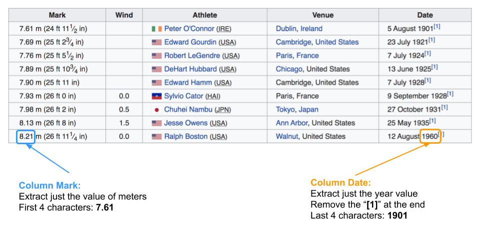
Figure 1.4: We just want these two pieces of data for all athletes
By following all the listed steps, you friend should be able to end up—at least
conceptually—with a table having two columns (years, meters), containing
the numeric values that will be used to graph the timeline:
Figure 1.5: We just want these two pieces of data for all athletes
Now that we have a better idea of the things to be done in a “manual” way, let’s discuss how to carry out similar steps from a “computational” point of view. For comparison purposes, we want to consider two approaches. One approach doing analysis the “amateur” way, that is, doing things the typical way in which most users and practitioners (non data scientists) tend to do things. This, of course, involves using Office-like software tools. The other approach is doing things the “pro” way (at least in its simplest form), using text files, writing code, and working with dynamic documents.
1.3 Analyzing Data the “Amateur” Way
The first approach to perform our Data Analysis project will be what we call the “amateur” way. This is by far the most common way in which most users and practitioners, that lack professional training, use to perform data analysis. It heavily depends on office-like software tools, the most popular being Microsoft Office (Excel, Word, Powerpoint, etc), but you can also find tools from Google (Sheets, Docs, Slides, etc), from Mac (Numbers, Pages, Keynote, etc) and Libre Office, to mention a few.
Learning about these tools is not the focus of this book, and you should not worry about all the details that we will show you in the following subsections. Our point is to walk you through some of the common steps employing these tools so that you get an idea of the advantages and disadvantages of this type of approach.
1.3.1 Getting the Data
First things first: to do data analysis, we need data. In this example the data source is wikipedia, and you can say that the wikipedia page of men’s long jump world record progression is the place where data is available. From a technical point of view, the source file is an HTML document, which is basically a text file written in a special syntax called Hyper Text Markup Language or HTML for short, the standard markup language for creating Web pages.
Most users (very likely those of you who haven’t taken any data anlaysis or data science courses before) would do the following to acquire this data set: select the table from wikipedia, copy it, and paste it into a spreadsheet (e.g. MS Excel or Google Sheets). We’re going to use Google Sheets for demo purposes.
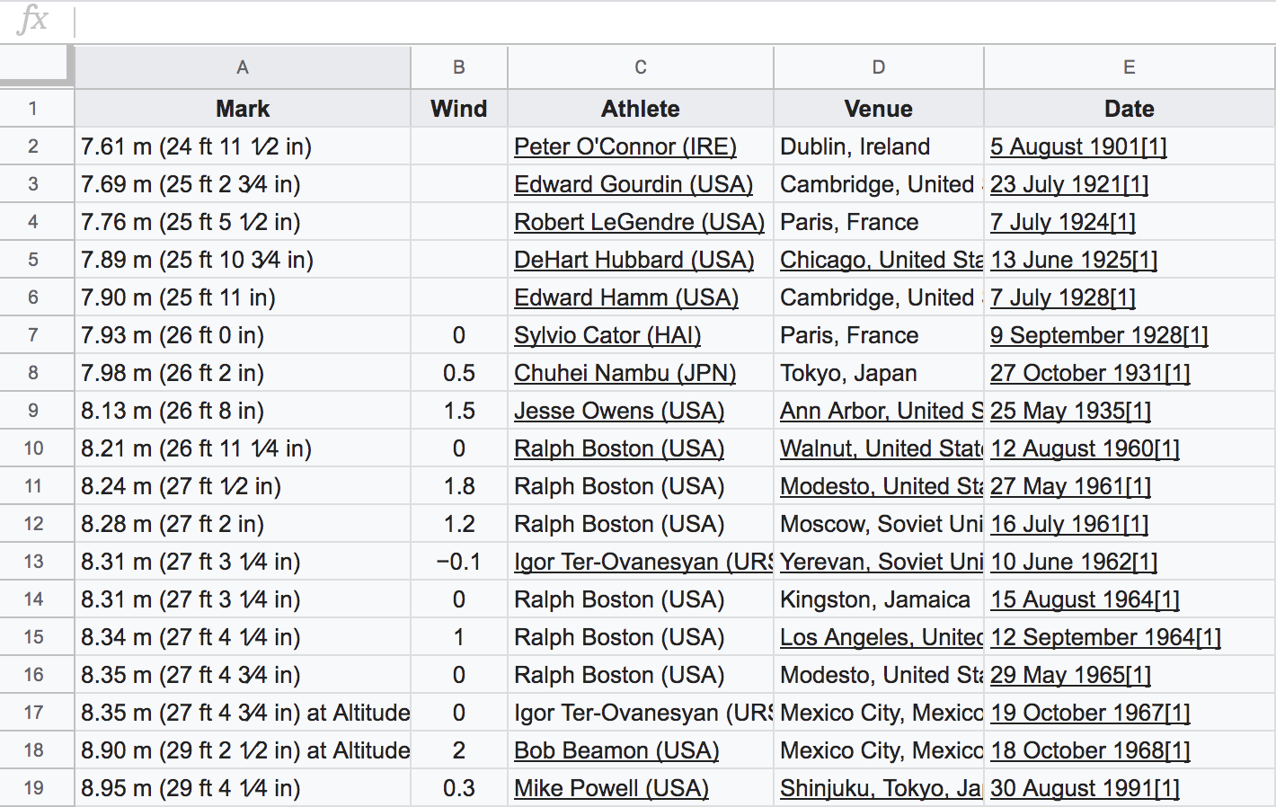
Figure 1.6: Data pasted in a spreadsheet
Having pasted the data in a spreadsheet, a naive user could immediately try to
graph a timeline by selecting the data from columns Mark and Date, and
invoke the chart editor.
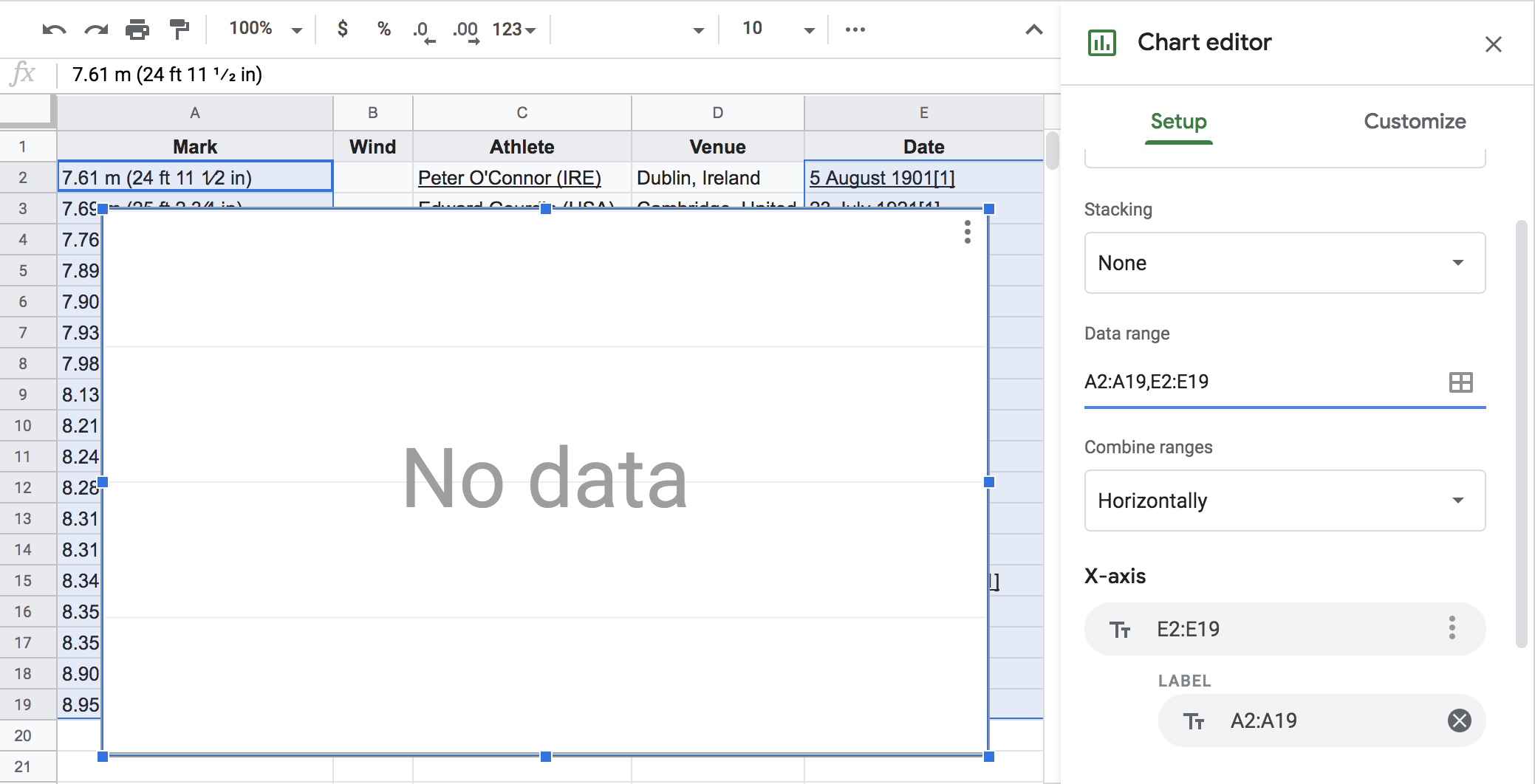
Figure 1.7: Failed attempt to graph a timeline
This won’t work because the data is not ready yet to be analyzed. As you can tell from the previous figure, the chart area is blanked showing a No data message despite the fact that we selected the columns containing the year values and the meter values. But we still have some work to do: extract the right pieces of data, make sure they are in a format that the chart editor can understand, and then iterate on the plot.
1.3.2 Transforming and Cleaning
Once we have the data in a spreadsheet, the next steps involve creating (at least) two more columns: one with the numeric values of meters, the other one with the numeric values of years. You don’t need to know how to do this with Google Sheet. We just want you to keep these required operations in mind.
1.3.3 Graphing Timeline
Once we have the right numeric columns for years and meters, we proceed
with the chart using the graphics menu. Again, don’t worry if you don’t know
how to graph things with Google Sheets.
Please take a look at the following slides to see the main steps that we performed in order to manipulate the “initial” data, create a couple of columns with “clean” data, which are then used to produce a timeline similar, although not identical, to the one from wikipedia.
1.3.4 WYSIWYG Tools
The type of office suites such as Google Docs-Sheets-Slides, Mac Pages-Numbers-Keynote, and Libre Office suite, are products known as What You See Is What You Get, commonly abbreviated as WYSIWYG, and some times pronounced as “wiz-ee-wig”.
These tools are ubiquitous products that form part of your software toolbox and are present in basically all desktop computers and laptops around the world. Office suits provide an array of products that can help you write a variety of documents, sliduments, and manage information with spreadsheets in a convenient way.
Some of the advantages of office suites:
- they are fairly intuitive to use (the learning curve is note very steep).
- they provide a display of the content you are working with that let you visualize its output format instantly
- you can preview the resulting document right away.
- you have a lot of flexibility to decide where exactly you want to place a table, or a graphic in a completely interactive way.
- you rarely need to memorize commands (although you may need to memorize key shortcuts)
- you basically focus on how the content looks like, and will be paying constant attention to the format and appearance of the document.
- ubiquitous: available in most computers
Unfortunately, not everything is as good as it seems to be.
1.3.5 What is wrong with a WYSIWYG-based approach?
Despite all these advantages, using word processors, spreadhseets, and slidewares, gives you a false sense of control. No doubt the interfaces are very visual, user-friendly, and relatively easy to learn. All the actions are performed through the use of the mouse or your trackpad, with several menu options, nice little icons, call-to-action buttons, dialogue boxes, and clicking and dragging operations.
While the appearance and the format of the produced reports, slides, and other class of documents is important, WYSIWYG tools have not been designed to give you more low-level control to interact with other software programs. Likewise, these types of tools do not tend to provide commands that would let you script the different steps to achieve a task. Likewise, these tools do not provide a history file or log-file that records all the series of actions you perform to produce a plot, or to insert a figure, or to create a table. Basically you do not have a way to avoid the manual, repetitive tasks, for which there is usually no record left.
Some of the disadvantages of office-like software:
- Labor intensive
- Time consuming
- Limit productivity
- Force you to think inside the box
- Very inefficient in the long term
- Limit collaboration
- Lack of reproducibility
- Closed source (you are not in control)
Do not get us wrong. We are not opposed to use office suite tools. As a matter of fact, we frequently use them for producing slides, and handle information in spreadsheets. These are great tools that you should learn how to use, and make them part of your toolkit. But in terms of data analysis projects, WYSIWYG tools are not the best resources, and they should play no (or a minimal) role in the analytical component of your workflow.
1.4 Analyzing Data the “Pro” Way
How do trained people in data analysis get the job done? We’ll show you one basic way to perform the analysis. But keep in mind that things can be done in a more sophisticated way, using a wide array of software programs, and definitely in a more programmatic fashion. For now, let’s keep it simple.
One alternative to office-like software is to use statistical data analysis software such as R. We will show you some steps and tools that you will later have the time to learn through the various chapters in this book, so don’t worry right now if some descriptions don’t make too much sense, or if things seem highly cryptic.
For illustration purposes, we are assuming that your machine has the required software, which in this case consists of R and RStudio—we introduce them in their corresponding chapters R and Rmd.
Here’s a screenshot of what is called an Rmd file, which is a text file
that allows you to combine in one single place your narrative and code.
Your narrative would be the text of your blog post, while the code are the
instructions to do all the computations.
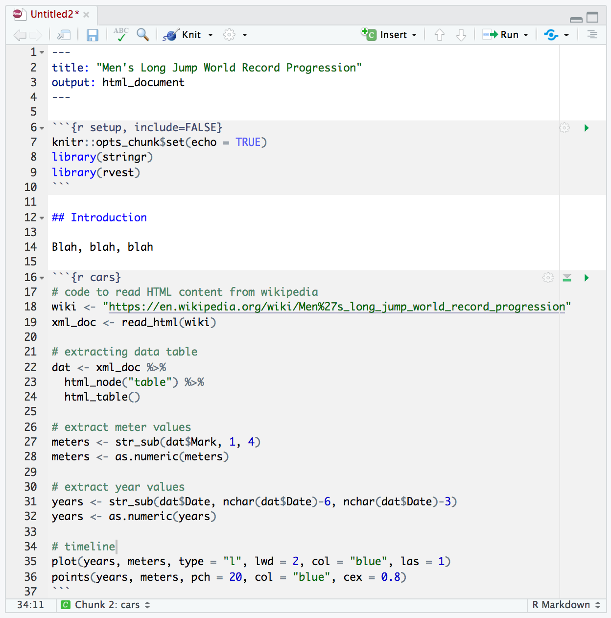
Figure 1.8: An R Markdown (Rmd) file, which is a type of dynamic document
You will have time to learn most of the nuts and bolts about R, using Rmd
files, etc. But in the meantime, let’s briefly disect some of the main parts
displayed in the screenshot above. We will focus on the lines of text contained
inside the two regions with a gray background color.
The code in the top gray region includes the following three lines. The first command indicates global options for controlling code in the document. The second and third commands load auxiliary packages with tools (functions) to do the job:
The second gray region is the one where all the action is happening. We have divided the commands in five “sections”, with a label or comment indicating what each section is used for.
# code to read HTML content from wikipedia
wiki <- "https://en.wikipedia.org/wiki/Men%27s_long_jump_world_record_progression"
xml_doc <- read_html(wiki)

# extracting data table
dat <- xml_doc %>%
  html_node("table") %>%
  html_table()

# extract meter values
meters <- str_sub(dat$Mark, 1, 4)
meters <- as.numeric(meters)

# extract year values
years <- str_sub(dat$Date, nchar(dat$Date)-6, nchar(dat$Date)-3)
years <- as.numeric(years)

# timeline
plot(years, meters, type = "l", lwd = 2, col = "blue", las = 1)
points(years, meters, pch = 20, col = "blue", cex = 0.8)
With the appearance of more formats, dynamic documents are a great resource. They offer an all-in-one source file where you combine narrative and code. No need to copy-paste; everything is scripted, no need to hard code any data.
Here are the slides illustrating the main steps for this other approach (data anlysis the “pro” way)
1.4.1 Pros and Cons
What about the advantages and disadvantages of using this second approach?
Pros:
- All instructions are recorded
- If you or someone else wants to repeat the analysis, all they have to do is open the source files containing the code, and tell the software to run the script.
- No need to copy-paste anything
- The analysis is more reproducible
- By using open source tools, you don’t depende on propietary software
- Even better, you can modify the code to meet your needs and preferences
Cons:
- you lose the visual convenience of seeing everything as it will appear
- there’s a steeper learning curve
- ceratin tasks may require more time to do
Overall, the time spent pays higher dividends in the long run.
1.5 Exercises
Here is an activity for you to try. It is very simple and it should not take you more than 10 minutes (15 minutes at the most).
The idea is to perform a toy data analysis project using the typical tools that most people have at their disposal, and in the typical way of carrying out all the steps.
We are assuming that you have a google account and that you are familiar with Google Drive. If this is not the case, then you can use Microsoft Office Word, Excel, and Power Point. Or Apple Numbers, Pages, and Keynote. Or perhaps Libre Office tools.
The idea is to use a suite of office software tools: a spreadsheet, a word processor, and a slidument. In this activity, you have to write down all the steps—it doesn’t matter if they seem trivial or insignificant—that allow you to carry out the tasks listed below.
- Open a spreadsheet and create a table with two columns and ten rows.
- Fill in the table with numbers. For instance, the first column can have values from 1 to 10. The second column can have random values.
- Make a scatterplot using the first column for the x-axis, and the second column for the y-axis.
- Create a table with summary statistics of the variables: minimum, median, mean, maximum.
- Open a document. You will use it to write a fake report.
- Type some dummy content like a title, a short abstract, and an introductory paragraph.
- Insert the table with summary statistics in the report. Make sure the table is centered, and that it has a caption.
- Insert the scatterplot in the report. Make sure it is also centered and that it has a caption.
- Finally, save the report in pdf format.
As you can tell, the previous list involves around nine major tasks. This
does not seem too many tasks. However, each task usually requires two or
more steps: things like selecting a tab from the menu bar and clicking on
a specific option. For instance, to compute each summary statistic you
had to choose a cell, type the = sign or click on the formula button,
used the mouse to select the range of values, and then hit the enter key.
Depending on how you computed these values, you probably followed betweeen
three or four steps, of which there is no record left. If anything, there
is only the used formula and the selected range of cells. But you do not
have a history of the steps that led you get all the results. The same
happens with the production of the table, and the scatterplot.
As for the report, history repeats itself. In order to insert the table and the scatterplot you have to click on the the scatterplot in the spreadsheet, copy it, move to the word processor, position the cursor in the spot where you wish to insert the chart, and then paste it. Then you have to select it and click the “Center” option so that it is center-aligned. The important thing is that none of these steps are recorded. And I am confident that you do not write down these steps.
So what is wrong with this typical way of doing data analysis and creating a report? Let’s pretend that your analysis is flawless. There are no bugs, no errors in the formulas, and everything is correct. But suddenly your boss or your client tells you that there is new data, and that you should rerun the analysis adding two more rows to the table. This may not seem a major change, right? You just have to add two more rows to the data table in the spreadsheet. However, you also have to update the formulas for the summary statistics to increase the range of the cells. Likewise, you also have to modify the range of cells behind the scatterplot. And then, you have to update the table and the plot in the document. If verything is fine, you can generate the pdf version.
Now imagine that new data is being added everyday, or that some values will be updated from time to time. The first couple of times you rerun the analysis and regenarate the pdf may be fine. But sooner or later you are going to start asking yourself: I wish I didn’t have to do this everytime the data change. If you work with MS Office tools, you probably know how to create a macro to start automating things. But most users do not how to do this. And even then, Excel does not provide the wide array of R packages that let you do most types of data analysis.