4 Establish a Research Question
Every project should have a research question.
Simply put, a research question gives you a North star, a sense of direction.
With our toy example of Men’s Long Jump World Records, the research question was fairly simple: What does the progression of records look over time?. Nothing fancy, it was just a purely exploratory question that is easily answered with some data visualization.
4.1 Example
Let’s make things more interesting by considering a less simplistic research question:
How does the men’s long jump world record progression compare to the women’s progression?
4.1.1 Data
To answered the above question, we need to get data of world records not just for men but also for women. The data source is still Wikipedia, with entries for both men and women records (screenshots shown below):
https://en.wikipedia.org/wiki/Men%27s_long_jump_world_record_progression
https://en.wikipedia.org/wiki/Women%27s_long_jump_world_record_progression
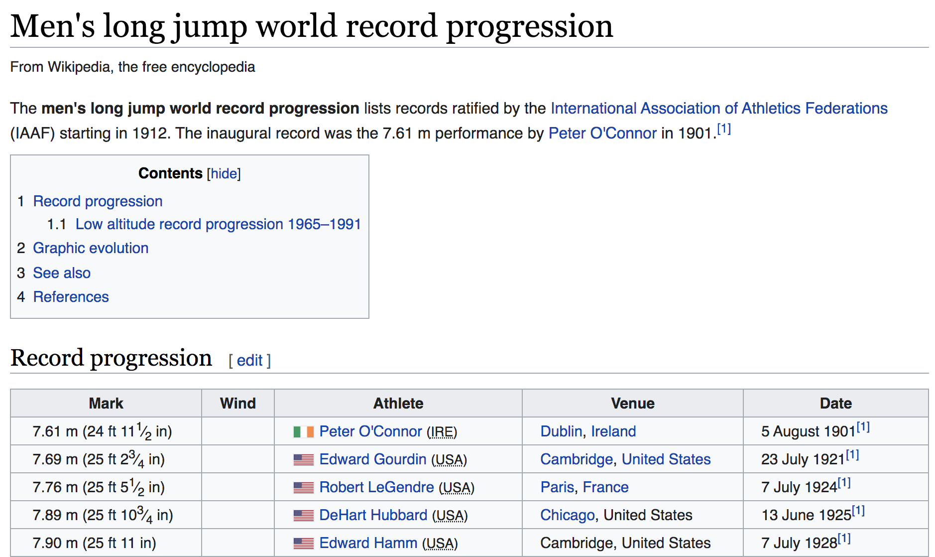
Figure 4.1: Men’s long jump world record progression (source: Wikipedia)
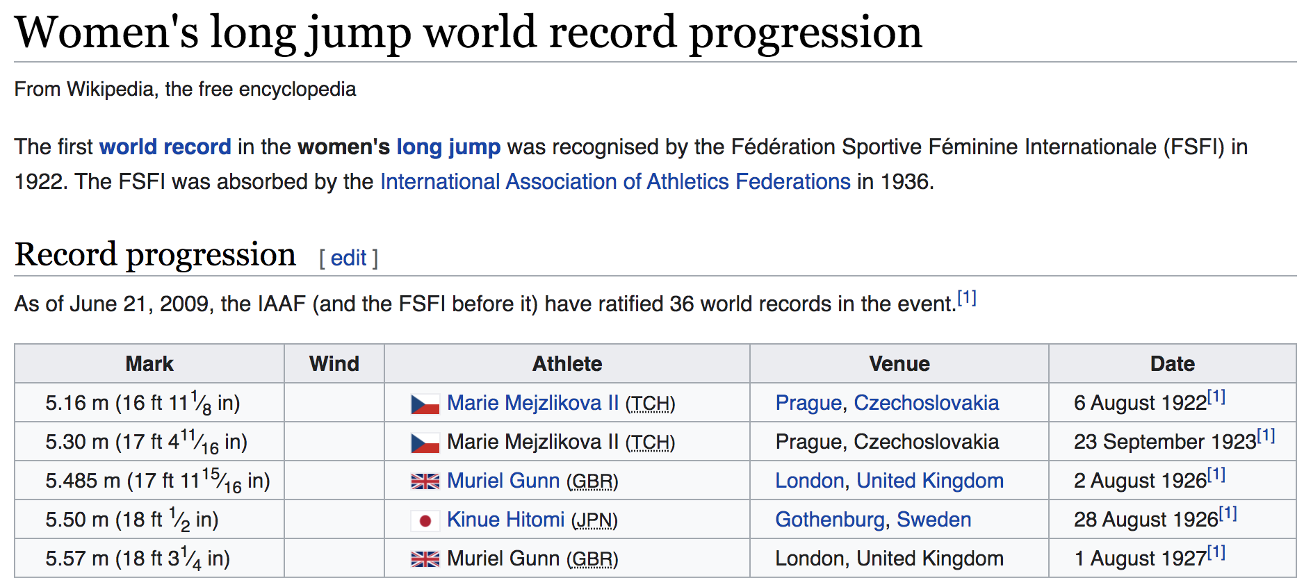
Figure 4.2: Women’s long jump world record progression(source: Wikipedia)
4.1.2 Filestructure
We are going to assume that we managed to download the wikipedia pages as
heml files: men-long-jump.html and women-long-jump.html.
To keep things simple, we are also assuming a fairly basic file structure with
two subdirectories: data/ and report/.
project/
   README.md
   data/
      men-long-jump.html
      women-long-jump.html
   report/
      report.Rmd
      report.html
We are assuming that the content in each wikipedia entry has been downloaded
as HTML files inside the data/ subdirectory.
4.1.3 Code
Another assumption is the use of a dynamic document report.Rmd which is
supposed to contain the narrative and the code. We won’t show you everything
that is inside the file; we’ll focus just on the code part.
Once again, we don’t expect that you understand all the code we use in this chapter. So don’t worry about not being able to make sense of all the lines of code shown below. You’ll have time to learn the meaning of these commands throughout this text. For description purposes, we’ve added comments to the code.
We need a couple of external R packages:
library(rvest)    # to parse html content
library(stringr)  # for text manipulation
library(ggplot2)  # for graphics
Now we are dealing with two input data sets. The steps are very similar to those described in the first chapter, that is:
- read in the HTML file and extracting the data table,
- manipulate the columns
DateandMarkto keep the desired pieces of data in the correct format, - and finally, graph the timeline.
Here’s the code for men’s data:
# code to read the html file and extract the data
men_html <- "data/men-long-jump.html"

men_dat <- read_html(men_html) %>%
  html_node("table") %>%
  html_table()

# extract year values
years <- str_sub(
  string = men_dat$Date,
  start = nchar(men_dat$Date) - 6,
  end = nchar(men_dat$Date) - 3)

men_dat$years <- as.numeric(years)

# extract meter values
meters <- str_sub(men_dat$Mark, 1, 4)
men_dat$meters <- as.numeric(meters)

# timeline
men_col <- "#00BFC4"
ggplot(men_dat, aes(x = years, y = meters)) +
  geom_line(color = men_col, size = 1.25) +
  geom_point(color = men_col) +
  theme_minimal()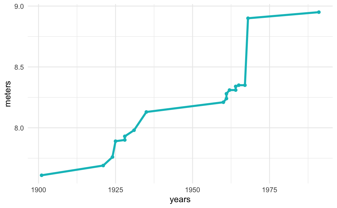
Here’s the same code but now applied to women’s data:
# read women's data
women_html <- "data/women-long-jump.html"

women_dat <- read_html(women_html) %>%
  html_node("table") %>%
  html_table()

# extract year values
years <- str_sub(
  string = women_dat$Date,
  start = nchar(women_dat$Date) - 6,
  end = nchar(women_dat$Date) - 3)

women_dat$years <- as.numeric(years)

# extract meter values
meters <- str_sub(women_dat$Mark, 1, 4)
women_dat$meters <- as.numeric(meters)

# timeline
women_col <- "#F8766D"
ggplot(women_dat, aes(x = years, y = meters)) +
  geom_line(color = women_col, size = 1.25) +
  geom_point(color = women_col) +
  theme_minimal()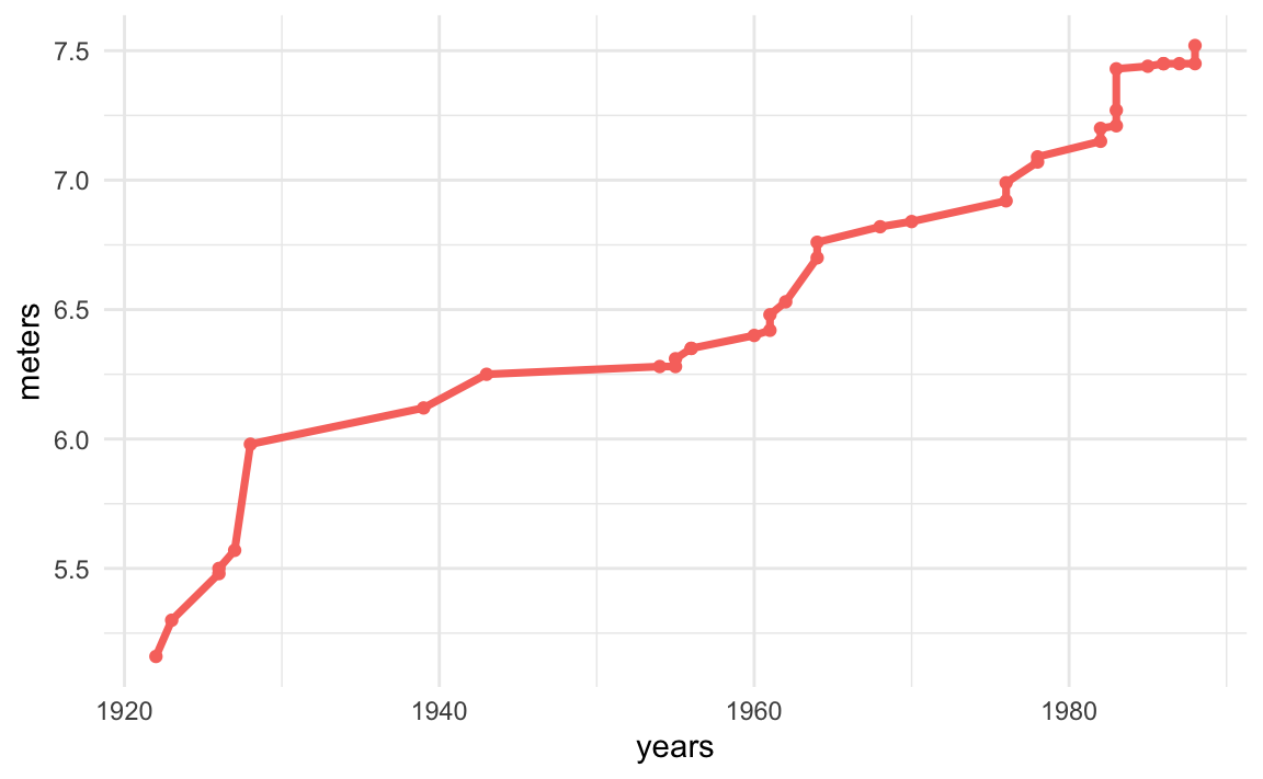
Going back to the resarch question, we are interesting in comparing the progression of world records between men and women. In order to do this, we have decided to assemble a new data table containing the years, the meters, and a categorical variable for the sex. We then use this assembled table to graph both timelines in one single plot.
# assembling new table with columns for year, meter and sex
dat <- rbind(
  men_dat[ ,c('years', 'meters')],
  women_dat[ ,c('years', 'meters')]
)

dat$sex <- rep(c('men', 'women'), c(nrow(men_dat), nrow(women_dat)))


# graph both timelines in one single plot
ggplot(dat, aes(x = years, y = meters, group = sex)) +
  geom_line(aes(color = sex), size = 1.25) +
  geom_point(aes(color = sex)) +
  theme_minimal() +
  scale_color_manual(values = c(men_col, women_col)) +
  labs(title = "Long Jump World Record Progression")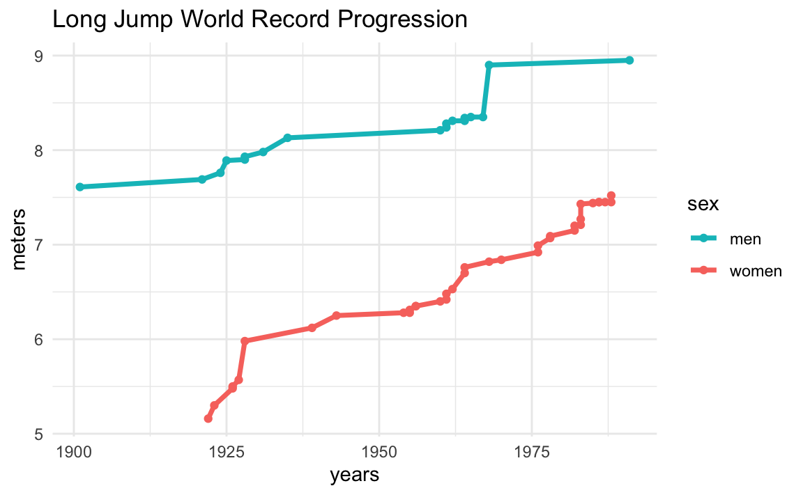
We obtain a timeline graph with the progression of records for both male and female athletes. Depending on the scope of your research question, and how deep you want to dig into it, this visualization could be all you need, or maybe you can take this as the starting point and then refine the research question into other more specific subquestions.
An interesting thing to look at the plot is the major difference between the current female world record of 7.52m from 1988 and the first male world record of 7.61m from 1901. The oldest male world record is 9cm longer than the current female record.
Another interesting aspect that can be appreciated from the graph, is the gap between male and female records over time. The chart gives the impression that this gap seems to get narrower and narrower in the long run. To confirm if this is in fact the case, we would need to do some math by subtracting the male record minus the female record at any given year. We are not going to compute this difference here, but it’s something to keep in mind.
Our punch line is that every project should have one or two primary research questions to give us guidance on where to go, and what to do. Simply having data (that could very well be super interesting and precious) may not be enough.
Using our cooking metaphore, simply having lots of ingredients and cooking utensils, may not guarantee success. You could even think of hiring the best chefs in the world, telling them that you have all sorts of food and ingredients, and asking them to prepare something for you. Yes, they are very capable of preparing awesome dishes, but they will certainly ask you: what do you want me to prepare? A full menu with entries, main dish, dessert, drinks? Or just a salad? Who will consume the prepared dishes (audience)? For what purpose? Is it a breakfast? Or a lunch? Or a dinner? Or a cocktail and happy hour?
It would be better if you tell the chef something like this: “I’m going to have a party with some coworkers, at noon this Saturday, and I would like you to prepare some Mexican food; to be more precise, I would like you to prepare typical food from the State of Michoacan.” All these details would dramatically help the chief prepare an appropriate menu, with the right amount of food, taking into account the guests’ food preferences.
The same thing should happen with data analysis projects. By having a question, possibly divided into a couple of subquestions, to guide the analysis, you narrow down the pipeline, and avoid wandering around without any sense of direction.